|
|
Post by redstatecap on Jun 25, 2009 22:46:55 GMT -5
Here's a challenge for the board. For every post you make on this thread, pick ONE Marvel title. It can be any title in Marvel history. Once a title is spoken for, it can't be picked again, but it can of course be discussed. In the interests of fairness, I'll stipulate that no one poster should grab up all the A-list titles. Post your choices for the best covers from that title. I won't put an exact number or limit on this (i.e. only the top 10). I leave it to your judgment, but please be thorough. Consult your collection or an online cover gallery and please pick only the best of the best. It might be wise to post your pick as soon as you make it. Then research your picks and edit your post when you're ready. This should avoid any unfortunate wasted effort. If possible, post links to the relevant online cover gallery. I will lead off with what I think are the best 15 Captain America covers: marvel.wikia.com/wiki/Comics:Captain_America_Vol_1Cap #1 THE Golden-Age cover. #110 #111 #115 The Red Skull by Kirby! #143 #147 #176 #231 Captain America #254!!! My all-time favorite. #287 Cap and Deathlok, Zeck #321 Cap goes postal, by Zeck Captain America Annual #8. Zeck strikes again. Even if I hate Wolverine. #378 Cap & Crossbones by Lim. A great cover from the heart of Gruenwald's run. V3 #48 eye-catching rendition of Cap in red, white, and black. V5 #18 nice cover with the Union Jack in the background If you put a gun to my head, I would further cut it down to these 5: Cap #1 Cap #115 Cap #176 Cap #254 Cap Annual #8 I discovered some interesting things in reviewing all these covers. First, there were a lot of great covers in the first 50 issues of the modern Cap era. Second, I realized that Mike Zeck had some really good covers. This rather surprised me, since I honestly do not like Mike Zeck's art that much. Third, I love Kieron Dwyer's art, but he didn't have a lot of great covers. Weird. Fourth, while V4 had some beautiful cover art, it suffered from the same flaws that a lot of modern comic art does -- that is, not clean enough or simple enough to be eye-catching. |
|
|
|
Post by scottharris on Jun 26, 2009 16:40:52 GMT -5
Over the past couple years, we've done some top cover lists for most of the major Marvel titles, though the threads are buried by this point. Before you posted this I actually started looking through them to see what covers we had nominated, and I will say that your final five for Captain America were totally different from the top 5 that I posted for my Cap list back in the day. Now, I wasn't including golden age comics at the time, otherwise I probably would have included Cap #1, but my top five would look something like: 1. Cap #113 2. Cap #111 3. Cap #1 4. Cap #332 5. Cap #110 Hey, what can I say, Steranko is the man. In fact, the "official" Marvel Top 70 really bilked Steranko, as I think he ended up with only 2 covers in the top 70 (Cap 111 and Shield 4). Here are some other Steranko covers that should have been in the top 70:     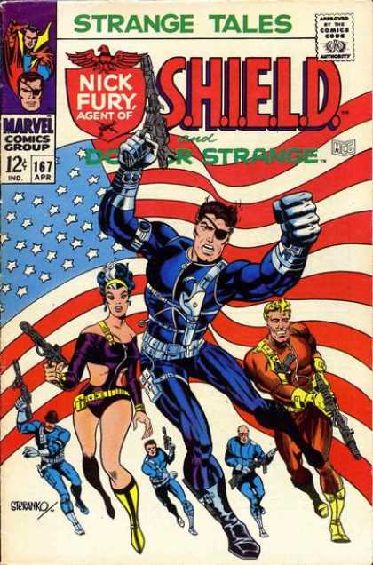 All famous, acknowledged classics. And as a bonus, here's a lesser known, fantastic Steranko cover that could have gotten some consideration, From foom #2:  I also agree with your assessment of Zeck, though I like his art more than you do by the sounds of it. HIs interior work could sometimes get a little stylized, with the bendy, tapering legs and the sort of slanted faces, but the dude could majorly crush cover design. He had some great covers, and not just on Cap. These actually made the list, of course:   But these Cap covers that you mentioned could also have been considered:   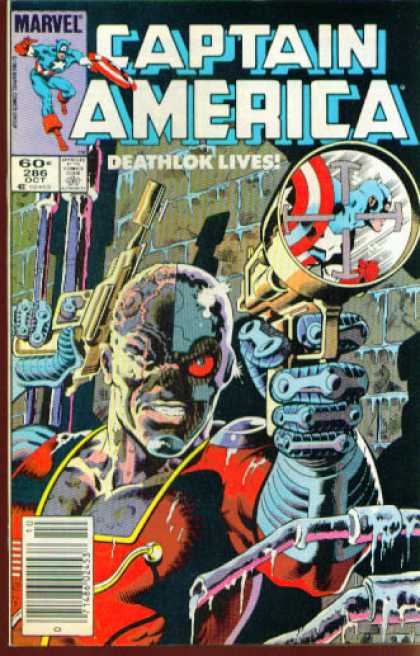  |
|
|
|
Post by scottharris on Jun 26, 2009 17:07:24 GMT -5
|
|
|
|
Post by scottharris on Jun 26, 2009 18:37:48 GMT -5
One of the few things Wizard does that isn't useless is a feature they have where they ask today's top artists to list their 10 favorite covers of all time with commentary. There are a few covers on these lists that consistently come up again and again. Only one of these made Marvel's list: 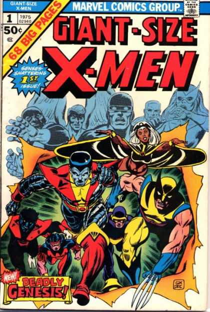 And, I think, its inclusion was deserved. But the other three that come up again and again but weren't on the list are these: How this got left off is beyond me. This is one of the most famous covers in Marvel history. C'mon, guys!  Yeah, it's the 1st Punisher, but it's also a great cover. Of course, I am biased because I love yellow covers, but really, this is a classic. Some day I'm going to put together a Top Ten Covers Featuring Characters Caught in Crosshairs. 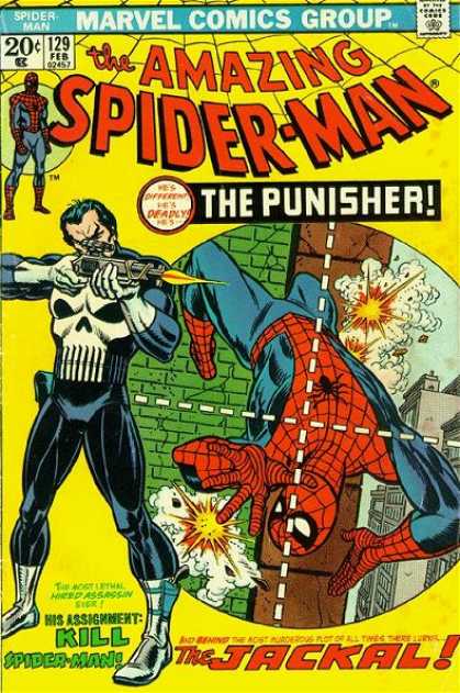 Now, this one doesn't do it for me personally, but it's a well known, striking cover, and the pros seem to really dig it:  Here's an online list of the 25 Greatest Comic Covers of all time, which skews heavily towards the Golden Age, but is still very interesting. Plus they have a detailed explanation of their criteria. The only Marvel covers to make the list are Captain America #111 and Silver Surfer #4: www.acomics.com/cover1.htm |
|
|
|
Post by starfoxxx on Jun 26, 2009 19:18:25 GMT -5
Some personal favorites are Avengers # 53 ( my copy still has that nice, white background)
it's an amazing composition, and great colors, vs. original X-men
Avengers #200 -Perez, say no more
Avengers #249 and #250
Avengers #167 -Perez, great composition, WOW!
Avengers #12 (I love it)
Avengers #54, #58, #60, #69
Avengers #181, #191, #211, #221, #223, #236
and round out a top 20 with WCA L/S #1, Avengers Volume 3 #4, and
JLA/Avengers #2 and #3.
... and I could see #12, #53, and #200 making the top 70 list.
|
|
|
|
Post by dlw66 on Jun 26, 2009 20:34:36 GMT -5
Somewhere around here Tana (I think) posted that great Neal Adams cover from Astonishing Tales with Black Bolt letting Thor have it. Just awesome.
|
|
|
|
Post by Tana Nile on Jun 26, 2009 23:47:26 GMT -5
I believe this is what you are referring to Doug - Amazing Adventures 8. Great cover (would be better without the Widow in the corner), disappointing story.  What I think would be really interesting is a top ten covers from each decade, 60s thru current. That way there's no bias towards any particular period of time. |
|
|
|
Post by scottharris on Jun 27, 2009 2:56:14 GMT -5
Okay, it's not hardly my favorite title, but I thought I'd take a look at Daredevil through the years. Here are some top Daredevil covers. I have to say that this series hasn't exactly had an illustrious history of greatness, but it has had a few notable runs in art terms, including Frank Miller, who turned in some very interesting covers, and more recently Alex Maleev, who did a lot of really excellent covers (in the modern style, meaning more pinup than storytelling). Here's my top 5: #1:  #2:  #3: %20v2%20041%20(ocd)-01s_400x400.jpg) #4:  #5:  I left out #181 (which made the official list), even though it's a well known issue (death of Elektra) because I just don't think the cover is all that, and the cover of the next issue, #182, is vastly superior in my opinion. A couple honorable mentions: 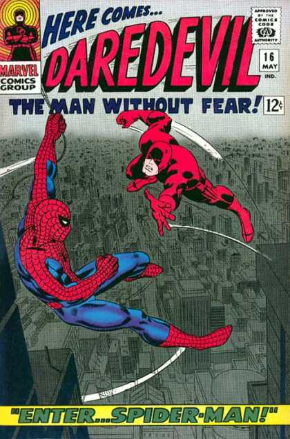    I love this last one. Yellow cover! Semi-frame! Big Hydra logo! All it needs is a 20 cent price point to really be great. Also, I couldn't help but notice that just about all the really good Daredevil covers show him up above the city, allowing the artists to work in some cool cityscapes. It really plays to the strength of the character I think. |
|
|
|
Post by redstatecap on Jun 27, 2009 3:06:41 GMT -5
Over the past couple years, we've done some top cover lists for most of the major Marvel titles, though the threads are buried by this point. Before you posted this I actually started looking through them to see what covers we had nominated, and I will say that your final five for Captain America were totally different from the top 5 that I posted for my Cap list back in the day. Now, I wasn't including golden age comics at the time, otherwise I probably would have included Cap #1, but my top five would look something like: 1. Cap #113 2. Cap #111 3. Cap #1 4. Cap #332 5. Cap #110 Hey, what can I say, Steranko is the man. I also agree with your assessment of Zeck, though I like his art more than you do by the sounds of it. HIs interior work could sometimes get a little stylized, with the bendy, tapering legs and the sort of slanted faces, but the dude could majorly crush cover design. He had some great covers, and not just on Cap. Zeck's main weakness to me is that every man looks like a young John Lithgow in the face. On interiors his anatomy seemed off, his posing was awkward, and I never got a real sense of dynamism from his interior art. I certainly agree that a lot of his covers were very good, but then again, take a look at them. They're attractive, but not particularly daring in composition or use of shadow. I rate him below Steranko as an artist. On the other hand, there is no one -- IMHO -- with a better grasp of dynamism, posing, and correct anatomy than Kieron Dwyer. His work in the Bloodstone Hunt era was fantastic. RSC |
|
|
|
Post by scottharris on Jun 27, 2009 13:34:44 GMT -5
I rate him below Steranko as an artist. On the other hand, there is no one -- IMHO -- with a better grasp of dynamism, posing, and correct anatomy than Kieron Dwyer. His work in the Bloodstone Hunt era was fantastic. RSC Well, sure. But then, I'd rate almost everyone below Steranko as an artist. I do agree on Dwyer, he was excellent, especially during the Bloodstone Hunt. His covers were good but not great. A book with Zeck covers and Dwyer interiors -- that I would be quite happy with. |
|
|
|
Post by scottharris on Jun 27, 2009 14:14:10 GMT -5
Here are my choices for top Iron Man covers. I have to say that Iron Man didn't exactly have a legacy of great covers, with one exception -- the run of Gil Kane covers during my beloved frame era circa 1972. Kane turned in a series of excellent covers, one right after another, from around #44-54 or so. Otherwise, it's kind of slim pickings. But, here are the ones I thought were the best: #1:  #2:  #3:  #4:  #5:  Some honorable mentions: A classic Cap/Iron Man cover:  I really like Kane's Iron Man, he seems more flexible and less bulky, as opposed to the later trend of making his armor a giant flying battleship:  It's YELLOW! YYESSSSSSS!!!!!  Really nice action cover:  And does this cover seem familiar to anyone? Below it is the Iron Man movie promo poster from several years later:  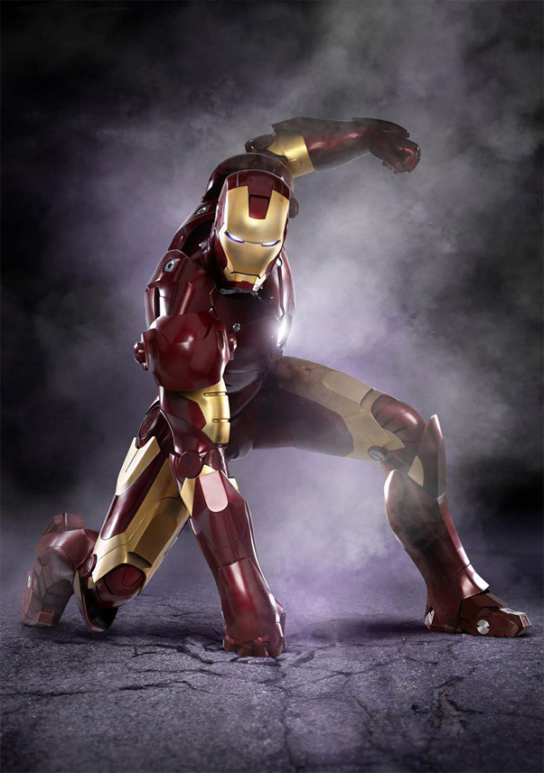 |
|
|
|
Post by scottharris on Jun 28, 2009 0:08:51 GMT -5
I've been thinking about what constitutes a "Top Cover". Someone earlier mentioned that many of the choices on the official list were first issues, which suggests that people were perhaps confusing their collector impulse with their artistic evaluation.
I'm not so sure, though, that covers can be viewed purely in terms of the image. Yes, there are some covers which have become renowned among readers solely for the artwork, but many of the most famous covers are also attached to issues that present stories of unusual impact or importance.
On my Iron Man list, I put #128, the Demon in a Bottle issue, at number one. It's a striking image, especially when taken in context (the image really jumps out when compared to the more or less straight ahead fighting action shown on almost every Iron Man cover prior to this). Yet, I'm not sure whether or not I would really notice the cover if it weren't for the impact the story had on the Iron Man mythology. If I didn't know anything about Iron Man at all, would this cover appeal to me? To the point of being one of the Top 70 out of tens of thousands of covers?
I think the answer is no, but it also doesn't matter. I don't think it's possible to separate our reading experience from our feelings towards the artwork. Nor is it necessary. "Top" is a pretty vague word, and for me, I think that the most important factor in determining whether or not it's a "Top" cover is not just whether the cover is well drawn or designed, but whether or not it is iconic. Some covers are just so well known, so ingrained in the collective collector mind, that they have become part of the language of comics. An example would be Giant Size X-Men #1. It's a really cool design and well drawn, dramatic. But it's also iconic in a way that few other covers are.
That's part of why I am unhappy with the official list (only part, of course). Many of the newer entries are well drawn. But without any context to them, they mostly blend together. I realized this most of all when looking through the Daredevil gallery. That series has had dozens of excellent covers in recent years by Alex Maleev. Excellent and completely interchangeable. When people years from now think back on their collections, will any one of these stand out? Or will they all belnd together into an impression that there was good art but nothing totally memorable? My guess is that if people do remember one specific cover out of that array of cool covers, it will be because the issue that cover appeared on was particularly memorable.
So for me, the covers on the Top 70 list need to not just be one or the other, but both -- not just well drawn, and not just fronting a key issue, but well drawn and memorable. Some covers are so impactful that they remain well known simply for being so cool. But others, like Iron Man #128, are less about the image and more about the icon. And for me, that makes it one of the Top 70 Covers in Marvel History.
|
|
|
|
Post by scottharris on Jun 28, 2009 1:01:16 GMT -5
Since everybody else is tied up with weekend activities, I'll go ahead and throw together my choices for Hulk (and also for Tales to Astonish). As most of you know, Hulk is my least favorite comic character, but he does lend himself to dramatic covers, so even though I can't stand him, I'm hoping to see some cool covers as I review his series. [edit: I kind of didn't] By the way, I'm getting most of my stuff from the excellent website coverbrowser.com. Here we are, the Top 5 Hulk covers: #1: #2:  #3:  #4:  #5:  And the Top 5 Tales to Astonish covers: #1:  #2:  #3:  #4:  #5:  And the honorable mentions:   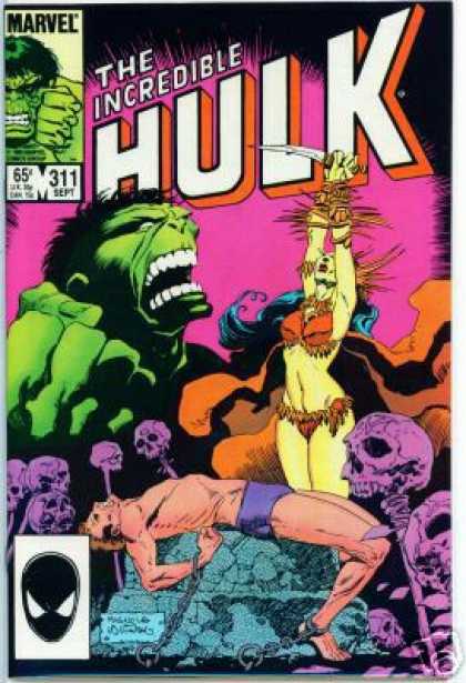 |
|
|
|
Post by scottharris on Jun 28, 2009 4:24:04 GMT -5
Darn, I posted this once but something went wrong and my browser deleted it. Well, that won't stop me. Here's the Top 6 Defenders covers (since I really only had 6 on my final list I might as well rank them all): #1:  #2: Let me just say how much I HATE Kevin Nowlan's art. But this cover is good. I guess if you give an infinite number of monkeys an infinite number of pencils...  #3: Before there was Todd McFarlane there was Arthur Adams. And before there was Arthur Adams there was... Michael Golden!  #4:  #5:  #6:  |
|
|
|
Post by scottharris on Jun 28, 2009 17:02:45 GMT -5
Top 5 Moon Knight covers. The new series has some nice covers, but Bill Sienkiewicz has them beat: #1:  #2:  #3:  #4:  #5:  |
|
|
|
Post by humanbelly on Jun 29, 2009 13:40:41 GMT -5
I've been thinking about what constitutes a "Top Cover". Someone earlier mentioned that many of the choices on the official list were first issues, which suggests that people were perhaps confusing their collector impulse with their artistic evaluation. I'm not so sure, though, that covers can be viewed purely in terms of the image. Yes, there are some covers which have become renowned among readers solely for the artwork, but many of the most famous covers are also attached to issues that present stories of unusual impact or importance. On my Iron Man list, I put #128, the Demon in a Bottle issue, at number one. It's a striking image, especially when taken in context (the image really jumps out when compared to the more or less straight ahead fighting action shown on almost every Iron Man cover prior to this). Yet, I'm not sure whether or not I would really notice the cover if it weren't for the impact the story had on the Iron Man mythology. If I didn't know anything about Iron Man at all, would this cover appeal to me? To the point of being one of the Top 70 out of tens of thousands of covers? I think the answer is no, but it also doesn't matter. I don't think it's possible to separate our reading experience from our feelings towards the artwork. Nor is it necessary. "Top" is a pretty vague word, and for me, I think that the most important factor in determining whether or not it's a "Top" cover is not just whether the cover is well drawn or designed, but whether or not it is iconic. Some covers are just so well known, so ingrained in the collective collector mind, that they have become part of the language of comics. An example would be Giant Size X-Men #1. It's a really cool design and well drawn, dramatic. But it's also iconic in a way that few other covers are. That's part of why I am unhappy with the official list (only part, of course). Many of the newer entries are well drawn. But without any context to them, they mostly blend together. I realized this most of all when looking through the Daredevil gallery. That series has had dozens of excellent covers in recent years by Alex Maleev. Excellent and completely interchangeable. When people years from now think back on their collections, will any one of these stand out? Or will they all blend together into an impression that there was good art but nothing totally memorable? My guess is that if people do remember one specific cover out of that array of cool covers, it will be because the issue that cover appeared on was particularly memorable. So for me, the covers on the Top 70 list need to not just be one or the other, but both -- not just well drawn, and not just fronting a key issue, but well drawn and memorable. Some covers are so impactful that they remain well known simply for being so cool. But others, like Iron Man #128, are less about the image and more about the icon. And for me, that makes it one of the Top 70 Covers in Marvel History. *Whew!*-- Scott, this is one exhaustive mission you've been on! And, judging from the time intervals of your posts, I'm thinking you've been laboring non-stop at your keyboard for, like, two days now. . . ! (Thinking of taking up a collection to get pizzas delivered to you-- and maybe a nurse to make sure you're holding up okay. . . ) And I must say, this has been making me think a little more deeply about what, to me, constitutes a "great cover". While context is important, I'm not sure I'd go so far as to say that an iconic or landmark issue should carry a major amount of weight in assessing the cover's. . . greatness. I mean, a great issue can have a lame cover. . . so surely the converse is true, as well (the oft-mentioned Avengers #223). To my mind, much of the cover's quality definitely should be judged before the interior story is considered at all. Why? Well, because the original purpose of that cover is/was to get folks to pick up the book and purchase it. Granted that's not the case so much anymore. . . but there is still a vast difference between an image that's beautifully rendered, and one that catches the eye, sparks curiosity, and sticks in the memory. (bobc covered this territory a bit a little while back, yes?). Hence, even accounting for differences in taste and the like, I think it's possible to sort of quantify a given cover's quality (I'm not sure if I'm phrasing that correctly) with a few questions: 1) Is the cover clear, and does it catch the eye? Is it visually interesting? Can you look at it, then look at three other covers, and still remember what was on the first one? 2) Does it compel you to pick up the book and see what's going on inside? (PPSM, of all titles, had some amazingly innovative covers in the middle of its run, despite the fact that the book was so mediocre. I bought a whole slew of back-issues at one point just because the covers made me want to read the story inside. Ka-ching!) 3) Does the cover capture a specific dramatic moment (realistically or symbolically), or is it simply a run-of-the-mill punch/struggle shot from medium range? 4) As an addendum to #1- has the cover stayed with your memory for a long time? 5) And then finally, does it accurately represent what is indeed happening in the story, or has it proven to be a false hook to pull the reader in? Illegitimately? 6) As a bonus-- is it clever, unconventional, or possibly does it even make you laugh? I mean, a truly insane person could probably attach a 1 to 5 point value to each of those questions, and then start going through the entirety of the Marvel Library quantifying everything, and I imagine there'd be some surprises on the list, as well as several of the ones we've seen repeatedly here. Ultimately, it's still subjective, but the results would be a far cry more balanced than the "Dude, everything newer than 2005 is totally bitchin'!" list that Marvel somehow developed. And I think it wouldn't fall prey so heavily to iconic issues. BUT- Butbutbutubut!!!!--- this would be a TERRIBLE way for anyone to spend their time! Really! I actually think an enjoyable debate about "this one's better" vs. "that one's better" is FAR more valuable than ANYONE literally sitting down and individually checking off enumerated attributes of 15 or 20 thousand comic book covers! I mean, not to offend any of my Trekkie or Beatlemaniac compatriots out there (and I'm healthy dose of both, believe me), but that kind of falls into the realm of becoming fluent in Klingon or memorizing the serial numbers of all the Beatles' international releases-- it. . . it just doesn't serve a greater good. And that kind of time and effort could certainly be more productively directed. I'm. . . I'm going off wildly on an editorial tangent, aren't I? Sorry, friends. Son of HB & I just got back from a tough 30-mile bike ride (1st of the summer-- oy), and I think the blood's rushing around in my head a bit too vigorously. Okay. Okay. Scott-- great job. Ohhh, I may have some different ideas about the Incredible Hulk covers, but I'll get back on that-- Catcha all later- HB |
|
|
|
Post by sharkar on Jul 1, 2009 11:38:54 GMT -5
|
|