|
|
Post by scottharris on Jun 24, 2009 2:49:58 GMT -5
To celebrate their 70th anniversary, Marvel is doing a series of Top 70 lists on their website. I'm still trying to figure out how the nominations and voting were done, but here's the list for Top 70 Covers: marvel.com/seventy_years/countdown/winners/covers/And Top 70 Comics: marvel.com/seventy_years/countdown/winners/comics/It's funny, even on the official Marvel boards, it's pretty much people just slagging the choices. Let's just say They seem quite random and a bit arbitrary and I kind of feel like I could randomly select 70 comics out of my collection and equal the choices. But I'm interested to see what other people think. Obviously they skew towards recent issues, and I'm not sure if this is a result of the voting process or the nomination process. But even the old issues that are on the lists are sometimes bizarre choices. For instance, Avengers gets 3 covers on the top cover list. One of these is the all-time classic Avengers #57. The others are... Avengers #8, the first Kang (er... okay?) and Avengers #168 (say what?). I'm not sure either of those covers would appear on my list of Top 70 Avengers Covers, much less Top 70 Covers in the entire history of Marvel. Anyway, what do you guys think? I have half a mind to put together my own Top 70 lists but I'm not sure I have that much energy. On a personal note, I also don't like that some of the covers (mostly over the past 10 years) are shown without any of the logos or word balloons that actually appeared on the cover when the comics came out. The graphic design is a vital part of any cover and without it you're just looking at posters. Removing the design elements turn some of these covers downright weird. For instance, Civil War #3 is one of the covers selected, except they only included the little strip of art, not the rest of the cover, making this look like an armband or a strange ankle tattoo. Where's the rest of the cover? Civil War actually had an interesting, unifying cover design and removing it totally negates the power of the image. Compare the version they posted: marvel.com/seventy_years/countdown/winners/covers/rank/28With the actual full cover:  |
|
|
|
Post by dlw66 on Jun 24, 2009 7:37:12 GMT -5
Those dopes at Marvel should have known that we've been doing cover threads (and better!) over here for a couple of years!! ;D
I will peruse the lists, but I can tell you right off the bat that I will be infinitely more inclined to comics from the 1960's-80's as opposed to much over the past 20 years (and no, that is not to say that there haven't been any good covers recently...).
|
|
|
|
Post by dlw66 on Jun 24, 2009 7:40:06 GMT -5
OK, I just started and a few things jump out: 1) two out of the first three feature Wolverine  2) they start the list at #1 instead of #70?? 3) look how many, even in the first 15 covers, are portrait-type images. Very little action. And yes, Scott, in spite of my love for Avengers #8 and it's cover (which was done better by George Perez in the Mighty Marvel Calendar for 1978), it is WAY too high on the list. |
|
|
|
Post by dlw66 on Jun 24, 2009 9:56:33 GMT -5
Some additional thoughts:
Marvels #4 is not only my favorite cover in the mini-series, but is way up there in terms of my favorite Spidey cover of all time.
The Phoenix motif is repeated way too much, pushing other way-more-worthy covers off the list.
The best Wolverine cover in the batch is Uncanny #132, and it's 62nd on the list??
Only one Thor cover made the cut?
No Neal Adams?
Secret Wars #10 should be in the top 10, if not the top 5.
Which brings me to echo Scott's question above -- what the heck were the criteria for this? Fan-boy gushiness (way too much Michael Turner)?
|
|
|
|
Post by Tana Nile on Jun 24, 2009 11:41:55 GMT -5
A truly cringe-worthy list, highly slanted towards books that came out in the last few years. How could you have the best covers ever and not include:  or:  or especially this:  |
|
|
|
Post by bobc on Jun 24, 2009 15:41:14 GMT -5
Man look at that beautiful John Buscema art on the Silver Surfer comic! This is what I meant when I said JB was incapable of drawing an awkward human pose. Look at the movement captured in Thor's form! I mean he really, really looks like he's going to bat the Surfer out of the stadium! One of the simplest, most striking and all around BEST covers ever to grace a comic book. As an artist, I can tell you that capturing that sense of windup and motion is so frikkin' hard--especially when capturing it that well!
Contrast that to the Kirby Thor cover. I love Kirby, but his human anatomy could be a little stiff. I just want to redraw Thor's mid-section to sag down a little!!! Poor Thor must be experiencing rigor mortis!
|
|
|
|
Post by humanbelly on Jun 24, 2009 18:26:16 GMT -5
This list MUST be the result of unavoidably skewed sampling, yes?
1) How many respondents can we assume really had passing knowledge of even, like, a third of the covers from 1961 to the present? Heck, even a tenth? Probably almost none.
2) Have Marvel's editorial trends in recent years been causing an attrition of the readers that do remember the 60's through the 80's? If so, that leaves surveys like this, naturally, to the younger- or at least more current- readers.
3) It is painfully clear that many, many choices were made with a nod towards "landmark" significance, rather than on their actual merits as covers. I mean, come on, what are the odds that so many of the top 70 would be first issues?? New Mutants #1?? Really??? Amazing Spidey #122 was a fine cover--- but was it better than the "Doc Ock Wins" cover from earlier in the silver age (The close-up of Doc Ock, w/ Spidey reflected in his glasses)?
Far be it from me to suggest that there's any editorial manipulation going on to make themselves look good (uhhhhh, do you know anyone that would have pulled Captain America Comics #1 up from memory?), but I think this survey may have had about as much legitimacy as last week's election in Iran.
It's just Marvel's characteristic self-promotion masquerading as fan interaction.
Heh-- I was glad to see an Incredible Hulk cover at #1, though. Best ever? Nah-- not by a long shot. That title itself had produced some better covers, I'm certain of it. (Issue #118 always comes to mind, in fact.)
HB
|
|
|
|
Post by bobc on Jun 24, 2009 18:57:08 GMT -5
Hee hee! I'd take my chances in Iran!
Hey HB--I have a question. You have mentioned this Hulk issue before. I recall from when I was really, really young, some Marvel comic that had the bad Inhumans in it--including a guy who was part tree and had sticks for fingers. Decades later I still have not found out what comic it was--but I now know it wasn't the Avengers or FF. Could this be it? I am assuming the comic I'm talking about probably came out in the late 60's since it was part of my 3rd Grade friend's older brother's collection. I think there was also an Inhuman who was part horse.
Can you help?
|
|
|
|
Post by humanbelly on Jun 24, 2009 19:18:37 GMT -5
Hee hee! I'd take my chances in Iran! Hey HB--I have a question. You have mentioned this Hulk issue before. I recall from when I was really, really young, some Marvel comic that had the bad Inhumans in it--including a guy who was part tree and had sticks for fingers. Decades later I still have not found out what comic it was--but I now know it wasn't the Avengers or FF. Could this be it? I am assuming the comic I'm talking about probably came out in the late 60's since it was part of my 3rd Grade friend's older brother's collection. I think there was also an Inhuman who was part horse. Can you help? Omigod! You can't believe how useful you're about to make me feel! Yes, it is, in fact, the very next two issues of the Hulk: #'s 119 and 120! (#119 also has a terrific cover). Evil Inhumans are taking over. . . oh, what was it. . . "Costa Salvadore" (in Central America, natch). Hulk washes up on their shores, and engages in battle. In #120, the US Army (with some sort of special UN mandate, I assume?) joins the fray. ALSO-- that Hulk image that Tana showed earlier is from Hulk Annual #1, where he went to Attillan, and faced-off with ALL of the Inhumans, I believe. And that occurred earlier in the timeline. Well. My work here is done. HB |
|
|
|
Post by bobc on Jun 25, 2009 9:24:31 GMT -5
Wow--my two earliest memories of comics involved the issue of the Avengers where the Vision just walks downwards through a sidewalk (issue 70-something I think), and then apparently these issues of the Hulk. I am gonna have to grab those issues the next time I go to my beloved Austin Books. Thanks HB--you have solved a mystery of a lifetime for me!!
HB--You are the Poster of the Eon, in my book. The proud Lion of Asgard, Volstag, once again proves his mettle!
I demand that HB be removed form the reservist list and made legit!!!!
|
|
|
|
Post by freedomfighter on Jun 25, 2009 9:46:56 GMT -5
The thing that really bothers me about the list is a bunch of the covers are just so much alike. The black Spidey suit, Phoenix, Storm looking hot... I can live with the fact that most younger readers aren't going to appreciate the same stuff I grew up with, but does the taste have to be so limited?
|
|
|
|
Post by humanbelly on Jun 25, 2009 10:08:25 GMT -5
*sniff*--- oh Bob, really. . . really, this heaping, glowing praise is certainly more than this rotund old warrior deserves. . . regardless of how accurate it might prove to be. . .
No, no-- such efforts come naturally to one such as I. Why, as I was saying to my Up With People kids last week as I single-handedly saved a school bus full of blind orphans from crashing into a burning ravine during a hurricane, "It's not for myself that I perform these multi-numerous feats of bravery and skill, but for the benefit of others, so that they too may be inspired by my prodigious prodigiousness!"
Ah, they were speechless with awe.
Naturally, you may feel free to quote me. (Remember, the name is "Humanbelly". One word-- only a capitol "H".)
HB
|
|
|
|
Post by humanbelly on Jun 25, 2009 10:36:26 GMT -5
The thing that really bothers me about the list is a bunch of the covers are just so much alike. The black Spidey suit, Phoenix, Storm looking hot... I can live with the fact that most younger readers aren't going to appreciate the same stuff I grew up with, but does the taste have to be so limited? Yep, yep, yep-- and far too many of the "Pin-up/Poster" style covers that have absolutely no bearing on or context to the story inside. That trend (which I've always hated), actually had a solid precedent 'way, 'way back when the Defenders run was ending, and it looked like they may have been commissioning covers before the books were even written. But how can those ever be deemed "best covers" ? They should almost be disqualified. A few off-beat ones that have stuck in my long-term memory: (although you'll have to look them up, like, on milehigh's sight or something): Howard the Duck #1 Marvel Age #30 Werewolf by Night #26 Avengers #177 & #223 Hmm. Also, didn't Conan used to have an awful lot of good covers? In fact, is there room for a discussion of what actually makes a good cover? (or has that happened before?) HB |
|
|
|
Post by dlw66 on Jun 25, 2009 12:48:01 GMT -5
In fact, is there room for a discussion of what actually makes a good cover? (or has that happened before?) HB I'm sure somewhere along the line we've discussed good/bad covers, cover trends, etc. But what the heck?? This is as good a time as any, and we have several newer users around here -- let's get it going again. Just some random thoughts: I would consider the Astonishing X-Men cover with Colossus and Kitty a portrait cover. However, since it is related to the story within and actually apes a scene therein, it would fall into a "good cover" category for me. I feel that a cover should of course be a hook for the reader marketing-wise, but it should also be somewhat true to what lies between the covers. It doesn't have to be an exact replica of a panel or page within, but it should be enough that the reader feels they know what they are going to get. You know, several of the covers within that list of 70 show art that used to be an extra "pin-up" page in the Annuals. |
|
|
|
Post by sharkar on Jun 25, 2009 14:48:33 GMT -5
Contrast that to the Kirby Thor cover. I love Kirby, but his human anatomy could be a little stiff. I just want to redraw Thor's mid-section to sag down a little!!! Poor Thor must be experiencing rigor mortis! LOL! Kirby must have taken anatomy lessons from Batman artist Bob Kane--er, I mean, Sheldon Moldoff.  Take a look at this 1963 Batman cover--I posted it about a week ago in another thread, but here it is again for comparison with the 1966 Thor:   Obviously, our man Buscema had no such problems with anatomy:  We've probably all seen plenty of other famous "Pietà covers" (as these are sometimes known as) throughout the years; it's a pretty popular motif. And I see that one even made the list of the top 70, coming in at #17 (deservedly so, IMO--but I guess it didn't hurt to have Wolvie on that cover too  !). |
|
|
|
Post by dlw66 on Jun 25, 2009 15:05:49 GMT -5
Just got around to Scott's link to the most important issues over the past 70 years.
While I think that X-Men 137 was a great story in itself and the culmination to an epic, there is NO WAY that it is more important than Avengers #4 (which is behind it one spot).
And, how in the world can anyone say that FF #1 isn't THE most important story, even moreso than AF #15?? FF #1 started the trend that would separate Marvel from DC -- Stan's and Jack's storytelling full of angst and dysfunction. That issue is the foundation of the Marvel Universe.
Saying that, I think if they had bumped X-Men #137 out of the top 5, slid FF #48 behind Avengers #4, and gone like this:
FF #1
AF #15
Avengers #4
FF #48
GS X-Men #1
That would be a pretty good 5.
More to come...
|
|
|
|
Post by bobc on Jun 25, 2009 15:10:19 GMT -5
Wow--great visual comparison! I was gonna mention before about how the head and feet should tilt downwards as well, but didn't want to be a nit-picker (but notice JB got it exactly right)
|
|
|
|
Post by humanbelly on Jun 25, 2009 15:17:23 GMT -5
[quote author=sharkar board=general thread=2609 post=30968 time=1245959313We've probably all seen plenty of other famous "Pietà covers" (as these are sometimes known as) throughout the years; it's a pretty popular motif. And I see that one even made the list of the top 70, coming in at #17 (deservedly so, IMO--but I guess it didn't hurt to have Wolvie on that cover too !). [/quote] I've never heard of that reference-- "Pieta cover"-- any background on its origins? I daresay, that type of image itself is pretty iconic. I imagine it exists 'way back into the reaches of even ancient art. You know what I first think of, though? In the original 1931 Frankenstein-- that poor villager bursting into the young Baron's wedding, carrying his drowned little girl in his arms. It really does function as a universal image for shocked, devestating grief. It's immediately understood, and never requires words. HB |
|
|
|
Post by bobc on Jun 25, 2009 15:22:34 GMT -5
When I first started in the art field, I did t-shirt art. And just because I could draw, I felt like I was obligated to draw really complex designs for every customer or I wasn't giving them their money's worth. Eventually I learned that a really good t-shirt design is one that is simple and direct--in fact, the real test was/is if you could "read" the design from a block away. A simple University of Texas t-shirt in Times Roman font will outsell a highly detailed drawing of all the wonders of UT 100 to one.
Why? Because it's simple and easy to read.
This is why the best remembered Avengers covers are the simple ones. The one that jumps into my mind is the cover of Hawkeye aiming an arrow with Ant-Man on the tip. The artist was not the best artist in Marvel's history, that's for sure, but that cover was a Hall of Famer. As much as I grew to hate New Avengers, I have to be honest and say that original cover with the lightning bolts was really, really good too.
Complex art is great for the story itself (George Perez is a great example--you always feel like you get your money's worth with him)--but when it comes to covers, K.I.S.S.
Keep It Simple, Stupid!
|
|
|
|
Post by humanbelly on Jun 25, 2009 15:30:19 GMT -5
This is why the best remembered Avengers covers are the simple ones. The one that jumps into my mind is the cover of Hawkeye aiming an arrow with Ant-Man on the tip. The artist was not the best artist in Marvel's history, that's for sure, but that cover was a Hall of Famer. ! Oh. Wow. Bobc, the Avengers cover you're refering to is #223, which is exactly one of the ones I sited in a post up above! We are on the same page. Another one I noticed today (that was a stand-out amongst several years of very mediocre Avengers covers) was #340, with the Wasp framed in close-up, with Cap's chest star making up the entire background. But you're right-- the simple, powerful images will always trump the cluttered battle scenes in the memory's eye. HB |
|
|
|
Post by bobc on Jun 25, 2009 15:59:31 GMT -5
That's exactly right, HB! The actual story held within that Hawkeye/Ant-Man cover I barely even remember but the cover itself is classic. Another great cover, that is very recent, is the Wolverine vs Hulk cover at #68 on this list. It is simple, direct, but conveys the size difference between the two characters--as well as the attitude--perfectly.
You know what covers I absolutely hated? The Final Crisis DC covers. I go to Austin Books and those rows are just a blur of red ink. Talk about over-selling the cross-over!! I hated that I had no idea which was which without picking up the book and opening it. Good LORD.
|
|
|
|
Post by spiderwasp on Jun 25, 2009 16:15:18 GMT -5
I couldn't get the cover list to open yesterday. It did today. I think I was better off yesterday. I might put 20-25% of these covers on the list but that's about it. I particularly think they hit the nail on the head with these:
Marvels 2 & 4 -just beautiful covers
Spider-man 39, 50, & 122 - classic images all
X-Men 101 - Dynamic entrance - this looks important
FF 112 - Hulk vs Thing, nuff said
Avengers 57 - The Vision cover is one of my all time favorites
Secret Wars 10 - This image of Doom really makes you want to find out what's inside
X-Men 136 - Hey, Byrne did the Pieta thing pretty well. That reminds me, would the Avengers 49 cover posted by Sharkar be called a Pieta Pietro or a Pietro Pieta?
Things that make you go hmmm... for me include:
X-Men 133 - So Wolverine fights 6 guys - am I supposed to be that impressed?
Avengers 168 - I'm not even sure this cover would be in my top 70 Avengers covers.
New Mutants 1 - Uhmm, there they are - running
X-Men 268 - Okay, it's Cap, Wolverine, and the Black Widow - there they stand
X-Men Alpha 1 - Is it just that these books contain the word X-Men and the number 1 that qualify them for this list?
As for my "What makes a cover good?", I'd say the following:
1. I have to want to read what's inside.
2. It has to connect with what's inside.
3. The image has to be striking and last in my memory. I agree that covers with lots of people rarely do this but neither do ones where the characters are just standing there - ie X-Men 268. Something dramatic should be happening.
I've talked about before how I used to be able to pull a book out of a box in a store and know if I had it, or at the least, had read it. With today's covers, I have to thumb through the book to see if anything strikes me as familiar.
|
|
|
|
Post by scottharris on Jun 25, 2009 16:20:39 GMT -5
I've never heard of that reference-- "Pieta cover"-- any background on its origins? I daresay, that type of image itself is pretty iconic. I imagine it exists 'way back into the reaches of even ancient art. HB Yup. "Pieta" is a term for art depicting the slain Christ being held by his mother. The most famous of these was done by Michelangelo in 1499:  |
|
|
|
Post by scottharris on Jun 25, 2009 16:32:37 GMT -5
When I first started in the art field, I did t-shirt art. And just because I could draw, I felt like I was obligated to draw really complex designs for every customer or I wasn't giving them their money's worth. Eventually I learned that a really good t-shirt design is one that is simple and direct--in fact, the real test was/is if you could "read" the design from a block away. A simple University of Texas t-shirt in Times Roman font will outsell a highly detailed drawing of all the wonders of UT 100 to one. Why? Because it's simple and easy to read. This is why the best remembered Avengers covers are the simple ones. The one that jumps into my mind is the cover of Hawkeye aiming an arrow with Ant-Man on the tip. The artist was not the best artist in Marvel's history, that's for sure, but that cover was a Hall of Famer. As much as I grew to hate New Avengers, I have to be honest and say that original cover with the lightning bolts was really, really good too. Complex art is great for the story itself (George Perez is a great example--you always feel like you get your money's worth with him)--but when it comes to covers, K.I.S.S. Keep It Simple, Stupid! Yes, I agree with this almost entirely. In a strange way, I think the advanced coloring techniques diminish the impact of today's covers. Now, that's not to say that the current coloring isn't frequently excellent and usually better than it was back in the day, because a good colorist today can really blow it out of the water. But those simpler, brighter colors and bolder black inking really allowed the images to pop, further highlighting a good cover design. Here's an example from this list of the "70 Best Covers", which I have to put in quotations because it's so patently wrong: 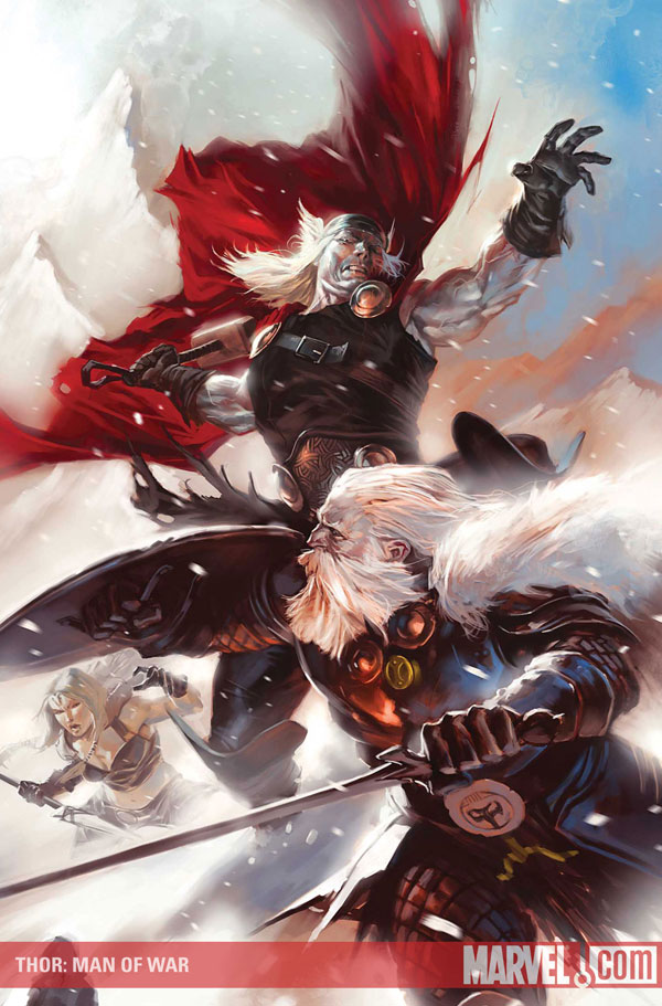 Now, is this a cool cover? Yeah, it is. It's really sweet. But it's also, as bob mentioned, very detailed with subtle coloring. When I looked at the list, with the little thumbnails, It looked something like this:  Now, here by comparison is the classic Avengers #57: 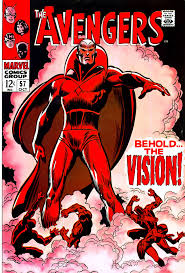 Even though Avengers #57 actually has some of the most subtle coloring of the era, the image still pops out at small size, whereas the new Thor cover is kind of a tiny, impressionistic blot. Again, I'm not saying that the new cover isn't good, because it is, or that new covers in general aren't good, because many of them are. But I agree with Bob that the emphasis on this sort of polished, detailed brushwork reduces the impact of the simple, iconic images that have traditionally gone into making a classic comic book cover. |
|
|
|
Post by scottharris on Jun 25, 2009 16:35:55 GMT -5
The one that jumps into my mind is the cover of Hawkeye aiming an arrow with Ant-Man on the tip. When I checked out the marvel boards to see what people there thought of this list, not only were most of the posts highly derisive of the list in general, but the cover of Avengers #223 was mentioned several times. 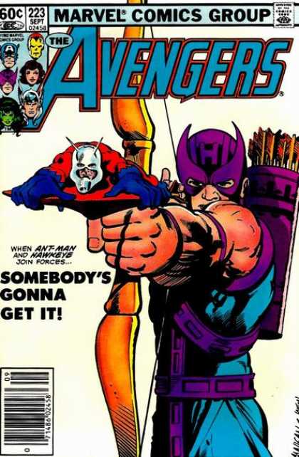 Certainly a memorable, cool cover. I'm not sure it would make my top 70 list, but I like it a lot more than some of the choices that did make it. |
|
|
|
Post by bobc on Jun 25, 2009 16:36:18 GMT -5
Right Scott. I love that painting of Thor and Odin but the Avengers cover draws your eye expertly.
|
|
|
|
Post by scottharris on Jun 25, 2009 16:47:15 GMT -5
New Mutants 1 - Uhmm, there they are - running This particularly aggravated me because New Mutants had a lot of really great covers, and this wasn't remotely one of them. Kind of gets me irritated now just thinking about it, actually, for whatever that says about me. He are some of my favorite New Mutants covers, just off the top of my head. Before there was Todd McFarlane or Jim Lee, there was Arthur Adams. Here's his cover for New Mutants #39, which made a significant impression on my 13 year old mind:  The very next issues has an Avengers crossover, allowing Barry Windsor Smith to give us this image of Cap decking Magneto:  And my favorite, and one of my favorite covers of my youth, this BWS swords-and-sorcery image of Kitty Pryde from New Mutants #36:  It's too bad #36 has that Secret Wars II corner tab messing up the nice, clean design (and this image I found is the newsstand copy, which doesn't have the cool M corner box design). It's clear that design elements meant nothing to whoever put together this list, since they presented much of the artwork without the logos or design elements, and also included X-Men #137, which is an iconic cover but which is also almost completely ruined by the huge advertising banner across the top of it. 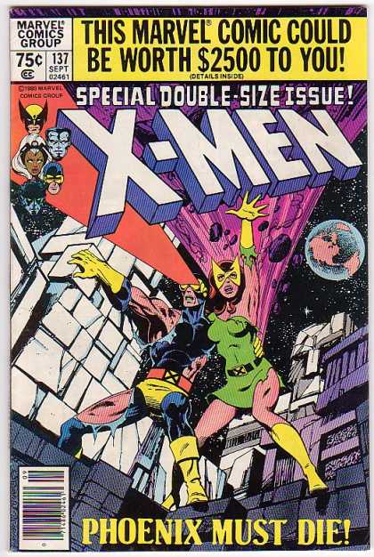 This one I'm actually on the fence about. It's really a great, iconic cover image, but the copy on the cover itself really wrecks it for me. I dunno. |
|
|
|
Post by bobc on Jun 25, 2009 16:51:15 GMT -5
Did you guys hear Michael Jackson just died?
|
|
|
|
Post by scottharris on Jun 25, 2009 17:00:04 GMT -5
He probably had a heart attack when he saw that Secret Invasion #1 was ranked ahead of Fantastic Four #1.
|
|
|
|
Post by Shiryu on Jun 25, 2009 17:03:20 GMT -5
Man look at that beautiful John Buscema art on the Silver Surfer comic! This is what I meant when I said JB was incapable of drawing an awkward human pose. Look at the movement captured in Thor's form! I mean he really, really looks like he's going to bat the Surfer out of the stadium! One of the simplest, most striking and all around BEST covers ever to grace a comic book. As an artist, I can tell you that capturing that sense of windup and motion is so frikkin' hard--especially when capturing it that well! To nitpick (a lot ;D) Thor's back leg should be slightly more oblique, and the foot should be bent at the toes. As it is, it's standing on the very tip, which just doesn't happen. But everything else in that cover is absolutely perfect even from an anatomical point of view. As an aside, today in London a bought a Silver Surfer pocket book, and it reprints this very story  The whole book is quite a deal, smaller format but 5 stories (Silver Surfer V1 1-5) for 3.99 ;D Yup. "Pieta" is a term for art depicting the slain Christ being held by his mother. The most famous of these was done by Michelangelo in 1499: Piet à It's Italian for "pity". And yes, it's a gorgeous sculpture. Back to topic, I haven't seen the list yet, hope to do so tomorrow and add my thoughts. |
|


 !).
!).

 The whole book is quite a deal, smaller format but 5 stories (Silver Surfer V1 1-5) for 3.99 ;D