|
|
Post by Tana Nile on Sept 28, 2007 15:07:53 GMT -5
OK, the people have spoken! Looks like every age is fair game. I know, it was sort of a silly question to ask in the first place, but I know some folks like to keep things clearly defined.
I'll throw this out there then: I've been re-organizing my books (again) and came across Mike Grell's Green Arrow: The Longbow Hunters, circa 1986. I probably haven't read these three books in 15 years. I was really struck by the quality of Grell's work here. He does the traditional comic book style art, but also mixes in some panels that appear to be pencil or charcoal pencil drawings, that are quite beautiful. Also, his page layouts are dynamic and novel.
|
|
|
|
Post by dlw66 on Sept 28, 2007 15:14:55 GMT -5
Although one could certainly argue that Frank Miller's The Dark Knight Returns started us on this mess we call "today's comics trends", at the time (and really, I still do) I regarded it as one of the truly most-exciting stories I'd ever read. It was shocking, fresh, avant garde, and an "I can't wait until the next issue comes out!" book. That being said, I felt that DC was just killing Marvel at the time, with Grell's GA revamp, Byrne's Superman, and Perez's Wonder Woman (and even the humor of DeMatteis/Giffen/Maguire's Justice League) topping my list of wonderful comics. It is a very well-remembered time, as the urge to dig out those books washes over me as I type this. Grell, as I stated earlier, was an eye-opener with his Legion work and that continued many years later with the story you reference, Tana. Yes, his page lay-outs were very catchy and he achieved a gritty feel to the story without the use of a lot of blacks. The costume revamp was good and made sense. His Dinah was beautiful, as was Shado. Ollie's switch back to plain old arrows was a good twist on the legend as well. Overall, a story that made me smile with satisfaction of money and time well spent. Thanks for bringing it up!!  |
|
|
|
Post by The Night Phantom on Sept 30, 2007 19:12:20 GMT -5
Y'know, Phantom, in my never-ending quest for the truth, I had originally checked the indicias, too. I agree this did not serve to clarify anything...instead, it raised more questions in my mind. I think this may have something to do with the distribution deal Marvel was under at the time. […etc., etc.…]An exaltation for an eye-opening post. I had a lot of those puzzle pieces already, but you showed me how they fit together!
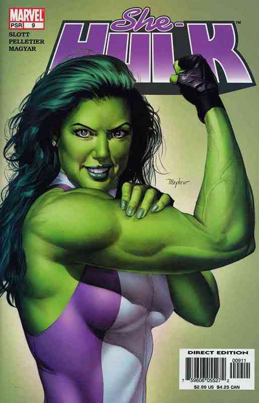
Hmmm...interesting that the first Silver Age appearances of Golden Age giants Namor, Cap, and the original Torch all occur in issue #4 of FF, Avengers and FF Annual, respectively. Perhaps the best homage to this tendency was in the fourth issue of John Byrne’s Sensational She-Hulk. At the end of the issue, which reintroduced the Blonde Phantom (technically already a supporting character since #2, in her civilian identity), the fourth-wall-breaking She-Hulk tells the former Phantom (no relation to yours truly, by the way):The next-issue blurb even declares, “The Doctor Is In!”…but #5, it turns out, features Doctor Bong. |
|
|
|
Post by Doctor Bong on Sept 30, 2007 19:22:42 GMT -5
Y'know, Phantom, in my never-ending quest for the truth, I had originally checked the indicias, too. I agree this did not serve to clarify anything...instead, it raised more questions in my mind. I think this may have something to do with the distribution deal Marvel was under at the time. […etc., etc.…]An exaltation for an eye-opening post. I had a lot of those puzzle pieces already, but you showed me how they fit together!
Perhaps the best homage to this tendency was in the fourth issue of John Byrne’s Sensational She-Hulk. At the end of the issue, which reintroduced the Blonde Phantom (technically already a supporting character since #2, in her civilian identity), the fourth-wall-breaking She-Hulk tells the former Phantom (no relation to yours truly, by the way):The next-issue blurb even declares, “The Doctor Is In!”…but #5, it turns out, features Doctor Bong. Aaand... how exactly is that a bad thing...? If you ask me, Doctor Doom is overexposed... ;D  |
|
|
|
Post by Tana Nile on Oct 4, 2007 9:32:53 GMT -5
How about Mike Ploog? He practically built the whole Marvel horror-hero line - Werewolf by Night, Ghost Rider, some work on Frankenstein's Monster I believe, and Man-thing. I thought he had a perfect look for horror books. His Werewolf is still the archetype in my mind - lean, agile, and mean looking! I saw him on a panel at San Diego this year (along with Roy Thomas and Gary Friedrich), and he was asked why he seemed to be always on horror books. He said he enjoyed it, and also Marvel felt he drew "good hairy characters"! (Hairy apparently included the Man-Thing as well as Werewolf).
|
|
|
|
Post by dlw66 on Oct 4, 2007 10:44:31 GMT -5
I've come across some Ploog work through TwoMorrows various books -- and yes, he's incredibly good at that genre.
Bernie Wrightson, as well... And Neal Adams, too!!
|
|
|
|
Post by Tana Nile on Oct 4, 2007 11:46:26 GMT -5
I've been trying to find words to describe Ploog's style, and what keeps coming to mind is fluid, and mysterious. I also thought there was a great use of spot blacks but that might be more due to inkers. I guess I'd have to have some books in front of me to figure that out. he definitely captured a sense of mystery and otherwordliness.
|
|
|
|
Post by The Night Phantom on Oct 4, 2007 18:49:51 GMT -5
Ploog’s work was so masterful in its own right and so instrumental in defining a subgenre that it deserves its own adjective, à la Kirbyesque.
That said, the team of Gene Colan and Tom Palmer deserves some credit. I can hardly (and wouldn’t want to) think of Tomb of Dracula without them, and their style was perfect for certain Doctor Strange tales also.
Generally I don’t care for black-and-white reprints of color comics, but I have bought some Marvel Essentials volumes covering various horror series. Not only does the subject matter lend itself to that look (in the classical Hollywood horror vein), but in particular work like Ploog’s and Colan–Palmer’s sometimes reveals its mood and creativity more powerfully without the distraction of color.
|
|
|
|
Post by Tana Nile on Oct 5, 2007 8:24:34 GMT -5
I've always thought Colan's best work was on Dracula and Dr. Strange. His straight-up superhero stuff never looked that appealing to me. But his style was perfect for both of these characters.
|
|
|
|
Post by dlw66 on Oct 5, 2007 20:33:51 GMT -5
I don't mean to steer this away from horror mags, but I have a comment on the above-mentioned Tom Palmer.
We've mentioned several times about the power inkers have over pencillers -- Joe Sinnott being the main subject of those conversations. I would encourage all who are able to view a copy of X-Men #64, the introduction and origin of Sunfire. The issue is credited to Don Heck (filling in for Neal Adams) and Tom Palmer. Palmer is credited as the "embellisher" -- understanding that there is a difference between inks and embellishing, I would say "did he EVER!"
This issue may be the single-most beautiful book ever attributed to Don Heck, and we have Tom Palmer to thank. Given Heck's output at the time (I believe he was on the way out at Marvel and heading to Wonder Woman, et al. at DC), I can honestly say that there are only 3-4 figures in the entire story that one could look at and say, "Yeah, Don Heck's art". Palmer exerts his influence in such a way that this story flows near-seamlessly between the Adams before and after. I truly can't understand why Heck wasn't just credited with lay-outs, thumbnails, whatever -- he's just not in the book.
That being said, we've discussed Sinnott and how he "saved" Kirby at times; we could have a similar discussion of Palmer exerting the same type of influence over Buscema's pencils in his last Avengers run (around Under Siege, Acts of Vengeance, etc.) when John was doing very loose lay-outs and Palmer the finishes; it was Palmer who kept the "look" from Buscema to Epting to whoever-came-next. But I'm just surprised that we see this from Palmer so early on in his career.
I'm not complaining, don't get me wrong. This is an extremely eye-pleasing story, and Roy Thomas writes a wonderful tale to boot. I just found it interesting given what I'd come to expect from Don Heck in that era how much un-Heck-like the book was.
|
|
|
|
Post by Nutcase65 on Oct 5, 2007 20:37:01 GMT -5
in comparison to silver-age artwork, have you noticed that several books are now just giving an 'artist' credit, rather than breaking it down to individuals?
|
|
|
|
Post by sharkar on Oct 7, 2007 16:58:29 GMT -5
An exaltation for an eye-opening post. I had a lot of those puzzle pieces already, but you showed me how they fit together! I'm glad my post was helpful, Phantom. Thanks for the exalt--and the feedback. |
|
|
|
Post by The Night Phantom on Oct 7, 2007 18:06:49 GMT -5
Thanks, Doug. I’m not much of an X-fan—not enough to seek out many back issues, anyway—but I’ll keep an eye out for X-Men #64. You make it sound very appealing in its own right (plus I already know something of the story), and I generally like Palmer’s work enough to be intrigued by an early example.
Palmer’s inking is more “overpowering” than most—occasionally that’s a shame, for sometimes his style will clash with the penciler’s. But when it works, it works beautifully. I think his inking has produced some of the classiest-looking comics ever—particularly in Avengers (especially with Buscema), in Tomb of Dracula, and in Marvel’s Star Wars.
Have any of the ’70s horror fans among you caught the Stoker’s Dracula limited series of a couple of years ago? This was the adaptation of the original novel, begun by Roy Thomas and Dick Giordano in Dracula Lives back in the day and finished up for the mini-series. It’s been collected in book format (hardcover, yes; softcover, I don’t know). The art is all black-and-white; while not quite in the same category as Ploog’s and Colan–Palmer’s, it’s quite nice.
|
|
|
|
Post by dlw66 on Oct 10, 2007 16:15:26 GMT -5
Concerning under-appreciated Silver/Bronze Age artists, as we have been with Mike Ploog...
Who would you like to give a "Nice Job!!" to, who maybe doesn't get the attention that the Buscemas, Neal Adams, Gene Colan, etc., etc. receive?
I'd offer up Dick Dillin of JLA fame, and Rich Buckler of Avengers and FF fame. Any thoughts or other nominees? (Short on time right now -- I'll post my specific "likes" soon!)
|
|
|
|
Post by dlw66 on Oct 10, 2007 18:48:58 GMT -5
Dick Dillin was for me a poor man's Dick Giordano or Irv Novick -- DC artists in the Neal Adams vein. Dillin's lithe figures personified the look of the late '60's-early '70's JLA. While not necessarily a master at either form or facial expressions, his work typified the DC "look" of that era and was certainly serviceable.
Rich Buckler toiled at both Marvel and DC and was again a very adaptable artist. Most memorable for me are both his Avengers and FF pages. While he never aped Kirby in the Avengers, his FF work was better before that stretch, as well as after when he could be his own man. My favorite Buckler stories are the Sentinel issues in the Avengers right after he took over; his FF #158 with the Quicksilver/Human Torch battle royale still takes me back to the days when I first laid eyes upon it.
|
|
|
|
Post by Tana Nile on Oct 11, 2007 9:41:59 GMT -5
My first exposure to Rich Buckler's work was on those Fantastic Fours you mentioned Doug. Because he was aping Kirby there, I don't think I got to see the 'real' Buckler til I picked up Astonishing Tales, with Deathlok. I thought he was a very solid storyteller, a good artist if not especially splashy. But he was one of those dependable artists - if I picked up a comic he drew, I knew I wouldn't be disappointed in the art.
|
|
|
|
Post by sharkar on Oct 11, 2007 18:23:21 GMT -5
Buckler was, by own admission, a great "swiper." My first exposure to his work--inked by Sinnott-- was Avengers #102 (only his second Avengers issue, IIRC). I remember thinking the art looked like Adams (the long, lean figures for some of the men, some of the facial expressions) crossed with J. Buscema (some of the facial features, though of course there was a lot of Sinnott there). As the credits for this particular issue weren't displayed until well in the story, I was surprised when I got to the name of the penciler and saw a new name there. (Also noted in these credits: the idea was for #102 was "suggested" by Chris Claremont.)
Buckler was versatile style-wise and seemed to adapt well to whatever book he was assigned to.
A book's just been published (Vanguard) called "How to Draw Dynamic Comic Books" by--Rich Buckler! It's available on Amazon. I know he'd authored a couple of how to books in the 80s, but those are out of print. I'll be buying this.
|
|
|
|
Post by Tana Nile on Oct 11, 2007 22:34:44 GMT -5
Of course, Rich also had Joe Sinnott inking him on FF, so his art was bound to look a bit like Buscema and/or Kirby's work on the book. I decided to pull out some of those old issues and remembered a funny gaffe Buckler had made. In FF 152, on the splash page, Reed has been thrown out of the Baxter Building by Mahkizmo (don't ask) and his left leg is stretched way out. If you look closely, you can see that he has a hand rather than a foot at the end of his leg! Of course, I suppose one could argue that Reed purposely made his foot into a hand to grab the building, but that's stretching it, isn't it? |
|
|
|
Post by dlw66 on Oct 12, 2007 14:54:39 GMT -5
Ouch! Has anyone read or seen Buckler's mini-series from the '80's featuring Namor and the Original Human Torch? They were historical, synopsis-type stories. I don't recall the writers. I had them (may still have them  ), and recall that his pencils were unlike anything I'd seen from him prior. Good -- just a different style. His Namor was much different looking than the Namor he'd drawn in the very-good FF #'s 147-149 (I love that story!! It was one of my first FF stories). Also, his Original Torch was different enough that one would not mistake him for Johnny Storm. |
|
|
|
Post by The Night Phantom on Oct 12, 2007 21:09:16 GMT -5
Has anyone read or seen Buckler's mini-series from the '80's featuring Namor and the Original Human Torch? They were historical, synopsis-type stories. I don't recall the writers. Roy and Dann Thomas wrote The Saga of the Sub-Mariner; Roy went solo for The Saga of the Original Human Torch. |
|
|
|
Post by Tana Nile on Oct 16, 2007 9:36:04 GMT -5
I still haven't had a chance to do much more than quickly look through my Marvel Vault, but I noticed on one page there was a Kirby sketch for a Thor cover circa 1971 and also the published cover, which was by Romita. In the early and mid seventies, at the beginning of Romita's tenure as art director (I am not certain of the dates) we began seeing more and more 'corrections' of covers by Romita. I often found this to be jarring, such as a Jim Starlin cover of Captain Marvel with an obvious Romita head superimposed. There are many more examples of this, and a lot of it seemed to do with floating head covers and just plain correction of heads/faces. I'm just curious if anyone else noticed this and what your reaction was to it. It almost seems to me that Kirby was dethroned as the 'house style' artist by Romita.
|
|
|
|
Post by dlw66 on Oct 16, 2007 10:41:59 GMT -5
Of course your suggestion of Romita's influence ties in directly with some flap over the Superman/Spider-Man crossover where Ross Andru (former ASM and Superman artist himself) didn't like the meddling by the powers-that-be with corrections by Romita and Curt Swan.
Ah, the "house look".
I think I've told the story before, but once I owned a Cap page by Sal Buscema and John Verpoorten. However, the page was signed by John Romita. I sent a scan of the page to Roy Thomas and asked him about it. He said that near as he could tell, the Jazzy one didn't have much to do with the page, but might have erased and redrawn an arm in one panel. I thought first off -- wow! Roy could tell Romita's work on an ARM! And secondly, wow! Romita has to correct Sal Buscema???
|
|
|
|
Post by Tana Nile on Oct 16, 2007 17:31:55 GMT -5
Of course your suggestion of Romita's influence ties in directly with some flap over the Superman/Spider-Man crossover where Ross Andru (former ASM and Superman artist himself) didn't like the meddling by the powers-that-be with corrections by Romita and Curt Swan. Ah, the "house look". I think I've told the story before, but once I owned a Cap page by Sal Buscema and John Verpoorten. However, the page was signed by John Romita. I sent a scan of the page to Roy Thomas and asked him about it. He said that near as he could tell, the Jazzy one didn't have much to do with the page, but might have erased and redrawn an arm in one panel. I thought first off -- wow! Roy could tell Romita's work on an ARM! And secondly, wow! Romita has to correct Sal Buscema??? I'm sure no artist likes to have someone 'correct' their art. I can understand in some cases, like when a really raw young artist has some difficulties with anatomy or facial expressions. But when it is simply a decision based on style, it just seems wrong. Of course we have discussed before how DC had Kirby's Superman redrawn. But you can really see Romita's stamp all over Marvel, particularly covers, in the 70's. It's interesting that you actually have original art that shows his retouching. And one can rightly ask, why in the world would Sal Buscema need to be redrawn? The mind boggles. |
|
|
|
Post by sharkar on Oct 16, 2007 18:57:10 GMT -5
... And secondly, wow! Romita has to correct Sal Buscema??? ...And one can rightly ask, why in the world would Sal Buscema need to be redrawn? The mind boggles. I would guess for a case like this, there was a deadline and the original artist may not have been available on site to make the correction (the correction being for something relatively innocuous, like a strange proportion, or the wrong costume, wrong hand). Romita was usually physically on site (he received a salary as Art Director or whatever his title was; it was a 9 to 5 job); whereas Sal, like many of the other artists, was a freelancer, usually working from home. So Jazzy was probably Johnny on the spot! As for the Romita faces, here's another tidbit: When JR first returned to Marvel, since he was known for his depictions of women (he spent many years on romance comics), Stan had him redraw the Sharon Carter faces in Cap's tales. Stan felt Jack's women were not attractive enough, so Romita redid Agent 13's face on a regular basis. (I guess Stan felt this was not needed when Sinnott or Colletta inked Kirby, as Romita did no such "corrections" on Sue, Alicia, Crystal, Sif, etc.) |
|
|
|
Post by dlw66 on Oct 16, 2007 19:37:17 GMT -5
Sinnott was trusted, and that comes through in his biography from TwoMorrows. I guess others were not.
Excellent point about the proximity of artists to "home base". I'm sure that is even more true today.
|
|
|
|
Post by Tana Nile on Oct 17, 2007 10:24:07 GMT -5
That's a very good point about some artists not being available to fix their art. Score another one for Sharkar! Still, to this day I find it jarring when looking at a book and I see that a figure or face has been redrawn by a different artist. I seem to recall that Barry Smith's early work got this treatment a lot, and Starlin too (IIRC). |
|
|
|
Post by sharkar on Oct 20, 2007 10:40:35 GMT -5
Thanks, dlw and Tana. Still, to this day I find it jarring when looking at a book and I see that a figure or face has been redrawn by a different artist. I agree. But when I was child reading comics, I didn't give this a second thought. For example, at DC (at least in the Superman family of comics), the Lois and Lana faces were all drawn by Kurt Schaffenberger- -so there was a real visual consistency throughout various books for those characters. And I recall a Silver Age FF (Kirby-Sinnott) issue in which Peter Parker and MJ appear in the stands of a college football game (they're of course sitting next to Wyatt Wingfoot). Peter and MJ's faces are drawn by Romita and it seemed perfectly natural, because to my child-age sensibility, that's what they looked like (i.e., as Romita drew them). Now I am older--and presumably, wiser  --so the change in styles within a story is jarring--but as an innocent, visually unsophisticated child I saw my heroes in one way: to me, the FF meant Kirby-Sinnott's version, the Avengers were Buscema's, Spidey was Romita's, the Legion was Swan's, etc; there was "brand recognition" (at least for children). |
|
|
|
Post by dlw66 on Oct 20, 2007 19:54:21 GMT -5
there was "brand recognition" (at least for children). I still largely think of those characters/books that way!! ;D |
|
|
|
Post by sharkar on Oct 21, 2007 17:55:13 GMT -5
I should amend my earlier statement that Schaffenberger did all of the Lois/Lana faces in the Superman family of books; he did most of them, but probably not all. (I'm referring to the 60s, when he was the regular Lois Lane artist.) But you get the idea.
I clearly remember at least one Lois Lane cover that he did not draw (it was Swan as I found out later). Lois was pictured in a bright yellow dress with green trimming, hands on hips, and laughing as bullets bounced off her. Superman was of course amazed at her newfound invulnerability. I remember this cover (IIRC #78 or thereabouts, published just after a LL 80-page Giant) because Lois' yellow dress made quite an impression on me...but I remember thinking her face looked kind of different (since I was used to Schaffenberger's pert version).
|
|
|
|
Post by Tana Nile on Oct 23, 2007 13:07:28 GMT -5
In a similar vein, I was thinking the other day about how during my initial years reading comics, I was reading both current books and reprints at the same time. I would get Amazing Spider-Man but also Marvel Tales, Fantastic Four but also Marvel's Greatest Comics, and so on. I never felt confused about the situation - I knew the reprints were older stories. But in retrospect, I find now that my primal images of Marvel characters all seem to come from those reprints. When I think of Spidey, I think of John Romita, not Gil Kane or Ross Andru. The same is true with Kirby on the FF and Thor, and John Buscema - my favorite SA artist - was doing those two books when I got on-board! I wonder just what it is that determines what becomes our mental picture of a particular character.
|
|


 ), and recall that his pencils were unlike anything I'd seen from him prior. Good -- just a different style. His Namor was much different looking than the Namor he'd drawn in the very-good FF #'s 147-149 (I love that story!! It was one of my first FF stories). Also, his Original Torch was different enough that one would not mistake him for Johnny Storm.
 --so the change in styles within a story is jarring--but as an innocent, visually unsophisticated child I saw my heroes in one way: to me, the FF meant Kirby-Sinnott's version, the Avengers were Buscema's, Spidey was Romita's, the Legion was Swan's, etc; there was "brand recognition" (at least for children).