|
|
Post by Shiryu on Jun 15, 2009 15:48:04 GMT -5
I don't think we mentioned it anywhere, but Dave Simons passed away the 10th of June  www.dave-simons.com/ www.dave-simons.com/ |
|
|
|
Post by sharkar on Dec 11, 2009 18:44:08 GMT -5
|
|
|
|
Post by humanbelly on Dec 12, 2009 8:04:20 GMT -5
Wow, my Mom's birthday as well! (He would have been too old for her, though). Say, Shar, can I toss in a cover that I've always kinda liked? (Although I'm not sure how to copy it here-)
Although it's not nearly the artistic iconography of the ones you've shown, Avengers #79 depicts a slightly distorted, metaphorically enlarged, leering, sneering Masters of Evil (or Menace or Evil Mutants or something) that is just terrific in its over-the-top depiction of "Villains Intent on Villainous Villainy!". One has the impression that JB may have come up with it after being told that the bad guys in earlier drafts just weren't "evil enough", or something. . .
HB
|
|
|
|
Post by sharkar on Dec 14, 2009 21:20:14 GMT -5
Say, Shar, can I toss in a cover that I've always kinda liked? (Although I'm not sure how to copy it here-) HB, of course you should post your favorite JB covers - - the more the merrier! And #79 is a great cover, for the reasons you mention (the leering, the distorted perspective, etc.)--it's so hyperbolic. Also, it appears to be 100% pure John Buscema -- his favorite inker (himself!) on his pencils. Basically to add an image, you want to insert the cover or image's URL (address) in between a pair of Image brackets in your post. You can get the Image brackets when you're composing a post- -it's in the toolbar row that starts with the red "Tube" icon, it's the fourth icon in: a little landscape with a white frame...alternatively, you can just type "img" and "/img" only using the brackets instead of the quotation marks I have here. You'll insert the cover's URL (address) in between the bracketed "img" and "/img". To get the cover's URL, just rightclick on the cover image and select "properties" and then copy the image's URL. (Or perhaps you have the image saved to Photobucket or the like.) I have posted a cover (below) that did not make the first cut into my previous post--yes, it's the Pietro Pietà cover (as Spiderwasp so aptly coined it months ago)...one of my all-time favorite covers. As a guideline, you can use the "Quote" feature on my post to see what this cover looks like underneath the image: 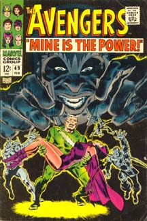 P.S. Hope your mom had a great birthday!!! |
|
|
|
Post by bobc on Dec 15, 2009 14:27:14 GMT -5
Every one of those covers is a knock out. JB's inability to draw an awkward pose has never been more obvious. Most comic artists have what we call a "catalog of poses" which they use over and over again. Not JB!! Every single pose had nuance and ease--that guy was just unbelievable. Even the guys I work with in the games field, those who aren't even much into comics, know and admire John Buscema.
|
|
|
|
Post by humanbelly on Dec 16, 2009 5:45:05 GMT -5
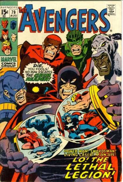 Holy cow, it worked! Look at that! Shar, you're the best. Say, going back to your original batch of JB covers, there, one notices a heavy use of the "feet planted in an extraordinarily wide stance" pose. It strikes me that this is one of his favorite visual conventions- and one that's used by lots of other artists, I imagine- but I've always thought it bordered on being a comic example of visual dynamics and artistic license trumping anatomy and physics. Sure, it looks firm and "planted"-- but it's a hopelessly vulnerable, awkward, uncomfortable, and immobile position to stand in, in real life. Geeze, especially TigerShark, there. I mean, try it folks. Put your feet down about 48" apart (heck, even 36"), and see if you're able to quickly dodge a photon blast, or leap at an attacker. . . or even take a quick step forward. . . ! Bobc, you're a bit of a weight-lifter--- tell 'em, tell 'em. What's gonna happen if Conan tries to press a couple of hundred pounds over his head w/ his feet radiating out from his torso at about 50-degree angles? Ohhh, these artist guys. . . (But. yes, I do concede that in JB's hands the effect is undeniably one of strength, grace, power, and internal life. No denying it.) HB addendum: "Lethal Legion"--- THAT was name I couldn't pin down. Lordy-- one of the worst Villain Team names ever. . . |
|
|
|
Post by sharkar on Dec 21, 2009 22:43:50 GMT -5
Every single pose had nuance and ease--that guy was just unbelievable. You said it, bob! JB may not have influenced other comic book artists as much as say, Kirby or Neal Adams, but that's because Buscema was truly one of a kind. I remember reading that some comic book artists found it relatively easy to copy Kirby and some others, but that it was just impossible to copy Buscema--his work was just too unique. (Sal came close and he had his own strengths, but he could never draw like his big bro--no one could!) Holy cow, it worked! Look at that! Atta boy, HB...I knew you could do it--nice job! ;D And come to think of it, #79 is akin to the Mags cover I posted (#49), as both feature malevolent villains looming over our poor heroes (#79 is far more exaggerated!). Say, going back to your original batch of JB covers, there, one notices a heavy use of the "feet planted in an extraordinarily wide stance" pose. It strikes me that this is one of his favorite visual conventions- and one that's used by lots of other artists, I imagine- but I've always thought it bordered on being a comic example of visual dynamics and artistic license trumping anatomy and physics. Sure, it looks firm and "planted"-- but it's a hopelessly vulnerable, awkward, uncomfortable, and immobile position to stand in, in real life. Geeze, especially TigerShark, there. Yes, that pose is a John Buscema staple. In fact I was going to post some other covers (in my original cover post) but for the sake of variety, I inserted some other covers in there. Which JB Silver Age covers did I "reject"? Glad you asked!  (Okay, okay, so you didn't actually ask--here they are anyway!)     Has anyone here read JB's (and Stan's) "How to Draw Comics the Marvel Way?" IIRC, in this book Buscema espouses drawing characters with arms flailing and legs spread wide to form angles...in other words, don't draw a character standing up straight with arms at his side--it's boring! The limbs should always be as far away from the characters' sides as possible. You can really see he practiced what he preached (as in the feet spread far apart pose we've been discussing). (I'd characterize Gil Kane as being very similar; Kane's bodies are always at an angle, there's great pliability and plasticity in his figures, as in Buscema's.) Another JB staple (at least during the Silver Age) was that Buscema liked to draw men with arms folded across their massive chests. Vision, Hawkeye, T'Challa, Namor, Cap...all the guys did it! Buscema was also fond of drawing men who are sitting--think of the famous Loki splash from Silver Surfer #4, or Mephisto (also in that Surfer series)...iconic images, but I also recall being struck by how he drew the villain Gambonno in a sitting pose (and lighting a cigarette, I think) in a panel that featured many characters, from Avengers #60. There was just such obvious virtuosity in the drawing! It's apparent JB liked to draw his characters in classical poses, and IMO it gives his work a timeless, frieze-like quality. |
|
|
|
Post by humanbelly on Feb 11, 2010 20:40:06 GMT -5
Hey, hey, hey! Hey Shar-- this is mostly for you!
As I mentioned elsewhere today, I've started reading my Hulk run (beginning w/ TTA #59). I think it's been about 25 years since I've read those, and I know I've NEVER read the Giant-Man and (the following) Sub-Mariner co-features. Giant-Man was generally awful at that point (for two of the stories, they actually apologized that they were maybe not as good as they'd hoped. Good grief.). The artist for much of that run was Carl Burges (sp?), along w/ a string of inkers. Stan's stories gave the impression of being written during a lunch break, trying to cram an improvised story in on top of the existing drawings.
HOWEVER---
The Sub-Mariner feature is really, really good comics! Especially for 1964/65-! I do recall you clue-ing us in that penciller Adam Austin was indeed an off-the-books Gene Colan. And when you realize that, it's just obvious. His figure-drawing, panel composition and ability to convey a truly dramatic moment is just years ahead of everyone else here. Much more like a pre-cursor to Neal Adams, than anything else. And clearly better than what Jack Kirby was doing with the Hulk feature in the other half of the book. And even in moments when he falls short, his weaknesses are more than compensated for by Vince Colletta's inking, which looks like his best work to me (comparable to his Thor work w/ Jack Kirby, and better than anything he did w/ Champions or Werewolf by Night, for instance.). And Stan's scripting seems to be inspired by it as well. These stories were done in a long, serial format, and Subby's involved on a quest to regain his throne, etc-- but the realism & grand scope of the artistic storytelling was able to support Stan's often overwrought style much more successfully. I can't believe I've never read these.
ALSO-- take a look at some of the covers, when you've a chance. Again, almost every one of the Subby ones (they mostly alternated every month) is a small masterpiece. (Possibly post a couple here, if you have a minute?) There are a couple that I would have submitted as a "100 greatest covers" nominee just on originality and artistic merit.
Man, here I am, a gushing fan-boy, 45 years too late. . .
HB
|
|
|
|
Post by sharkar on Feb 12, 2010 19:35:36 GMT -5
...The Sub-Mariner feature is really, really good comics! Especially for 1964/65-! Subby was the first feature Gene drew for 1960s Marvel, and according to interviews he didn't particularly like drawing Namor because he didn't want to draw the character's trademark triangular head (Gene was more into realism). I do recall you clue-ing us in that penciller Adam Austin was indeed an off-the-books Gene Colan. And when you realize that, it's just obvious. His figure-drawing, panel composition and ability to convey a truly dramatic moment is just years ahead of everyone else here. Much more like a pre-cursor to Neal Adams, than anything else. Yes! Colan never got the credit Adams (or Steranko) did, yet Colan used those crazy panel compositions/layouts all the time! Whereas many pencilers (Romita and Kane, to name just two) used thumbnails to lay out the entire story, Colan didn't; he looked at the entire page design/composition. His "organic" method affected the story's pace and at times he had to cram in a lot of action in the last page or so. Stan and Roy weren't crazy about Gene's pacing, but his art was so singular they usually didn't make revisions (Shooter is another story altogether, for another time). You know, in the early-mid 1960s when Marvel was starting to take off, Stan usually had Kirby provide layouts for artists who were new to the "Marvel Method" (this included industry veterans like Buscema who were returning to comics). By doing this, the penciler would get used to working without a full script and get an idea of what Stan expected (i.e., Kirby's dynamism). One exception to this practice was Colan; when he joined Marvel he wasn't given Kirby layouts to follow, because Colan's own style was just too unique. Colan's use of chiaroscuro...his page design...his storytelling--he's one of a kind. And even in moments when he falls short, his weaknesses are more than compensated for by Vince Colletta's inking, which looks like his best work to me (comparable to his Thor work w/ Jack Kirby, and better than anything he did w/ Champions or Werewolf by Night, for instance.). I agree; I think Colan and the (IMO underrated) Colletta made a great team. ALSO-- take a look at some of the covers, when you've a chance. Again, almost every one of the Subby ones (they mostly alternated every month) is a small masterpiece. (Possibly post a couple here, if you have a minute?) There are a couple that I would have submitted as a "100 greatest covers" nominee just on originality and artistic merit. You're right, there are so many great covers! Here's a pair...   Colan also drew the Iron Man feature in Tales of Suspense, so I'll toss in a couple of Namor-IM covers. I know Colan's anatomy is not "perfect" --look at those legs, the chests--but d**n, it's powerful!   |
|
|
|
Post by sharkar on Feb 12, 2010 20:01:48 GMT -5
More 1960s Colan covers (in a couple he seems to be doing his best Buscema "legs apart" impression ;D). I always got a kick out of how Colan drew feet--they often seemed pretty large, especially when compared to the length of the character's calves. (On a related note: Martin Goodman thought Colan drew females with too-short legs.) The estimable Colan-Colletta team produced a really gorgeous Medusa in Marvel Superheroes #15--she was feminine, beautiful and mysterious (I think some artists draw her looking too sharp-edged). Black Bolt looked pretty good in this story too; you get a sense of his power and his stoicism. (BTW, if you can't get a hold of this MSH issue, the Medusa story is included in the recently-released Inhumans Masterworks collection.)    |
|
|
|
Post by humanbelly on Feb 13, 2010 6:57:56 GMT -5
[You know, in the early-mid 1960s when Marvel was starting to take off, Stan usually had Kirby provide layouts for artists who were new to the "Marvel Method" (this included industry veterans like Buscema who were returning to comics). By doing this, the penciler would get used to working without a full script and get an idea of what Stan expected (i.e., Kirby's dynamism). One exception to this practice was Colan; when he joined Marvel he wasn't given Kirby layouts to follow, because Colan's own style was just too unique. Colan's use of chiaroscuro...his page design...his storytelling--he's one of a kind. Ahhh, now this explains a whole 'nother set of questions I had, Sharkar. I'm about 25 issues into the run, and the art credits are often saying things like, "Layouts by Jack Kirby; Art by Mickey Demeo (or Gene Colan, for one issue, or Bill Everett on the Hulk, etc.), and inking by whomever. For one of the Subby/Iron Man crossover issues it was layouts by Colan & art by Kirby (!). But, I couldn't quite understand why the art didn't seem to have a trace of Kirby's style to it. NOW I get it. And I think this practice was particularly good for Bill Everett on the Hulk feature, as I think layout may not have been Bill's strong suit, but boy, he really shines here. Possibly because his efforts can be focused on expressiveness of face and form, and on his unexpectedly rich and detailed inking talents. Really a terrific artist whose legend I never fully appreciated. Ha! You chose two of the covers that totally grabbed me, as well! HB |
|
|
|
Post by sharkar on Feb 22, 2010 23:04:41 GMT -5
...For one of the Subby/Iron Man crossover issues it was layouts by Colan & art by Kirby (!). But, I couldn't quite understand why the art didn't seem to have a trace of Kirby's style to it. If you're referring to Tales to Astonish #82, you're right--it doesn't look much like Kirby at his Silver Age best. But it's probably not a matter of Kirby drawing over Colan layouts (I don't think Kirby penciled over anyone's layouts in the 1960s; it was usually the other way around). Look at the simple, three-and-four panel page grids that dominate this story; such conventional grids would not have been the work of Colan, so it's pretty apparent Kirby wasn't working over Colan layouts/breakdowns. Rather, as noted in the story's credits, Colan took ill and couldn't finish the story. So Colan did the first couple of pages, and then Kirby was called in--probably at the last moment--to draw the remaining pages. The Kirby work here is far from his best (same could be said of his fill-in art for the next issue, #83). It appears Kirby was just banging this out to get it done, he took shortcuts: for example, he resorted to the three-and-four panels per page I mentioned above (not typical of his 1966 work). He was in a hurry. But it's understandable when you consider his workload; as noted in that issue's Bullpen Bulletin, at the time Kirby was already doing full pencils on the FF, Thor/Tales of Asgard, Cap (Suspense)...as well as laying out the Hulk (Astonish) and SHIELD (Strange Tales) features. |
|
|
|
Post by sharkar on Mar 23, 2010 23:58:49 GMT -5
Goldenfist's post earlier today about the upcoming Under Siege book inspired me to go through my Avengers volume 1 collection, and I settled down to read a few issues I'd never read before. One such issue was Giant Size Avengers #1, the lead story of which was penciled by Rich Buckler. Well, you can probably guess what I'll say next: my God what a lot of swipes! Now, I'm not referring to Buckler's depictions of the famous shot (from a 1940s cover) of the All Winners Squad; or the equally famous shot of the High Evolutionary from the HE's debut in Thor; or the Avengers vs. X-Men battle from Avengers #10; or the Wundagore scenes; or a Namor shot. These are (I assume) meant to be deliberate recreations of iconic scenes. In addition, in some panels the Vision and Thor look at times to be based on Barry Smith's versions (Vizh circa Avengers #66-67 and Thor circa #100); plus I see some of Buscema's influence in Wanda (in particular there's a shot of her standing that's very similar to a JB Wanda stance in #53). In these cases, Buckler could be said to be "influenced" by how earlier Avengers artists handled the characters, which is somewhat understandable (even though Buckler should have had a familiarity with those characters already, since he'd penciled several Avengers issues starting with #101). No, what I'm talking about the outright use of Kirby's earlier work as "layouts" for Buckler that goes beyond being "influenced" or inspired. Buckler's reputation as a swiper is well-documented (which is a shame, because from what I've seen his own "non-swipe" work is pretty good). And I've written previously about the abundance of his swipes during his stint on the Fantastic Four, but at least those were mostly swipes of Kirby FF characters for the FF book. But here in GSA #1, for example, he's using Wyatt and Johnny poses for Whizzer and Miss America! The sheer volume of Kirby swipes really distracted me and ruined the GSA story for me. In the images I've posted below, the 1974 Buckler GSA panel is followed by its Kirby source.   from FF #61, 1967...even the floor grid is swiped! ;D   from FF Annual #4, 1966   from FF Annual #4, 1966, Johnny and Wyatt leap into the void (in Buckler's panel the characters doing the leaping are Miss America and Whizzer).   from Captain America #105, 1968   from FF #99, 1970   from FF #79, 1968   from X-Men #4, 1964 |
|
|
|
Post by humanbelly on Mar 26, 2010 5:23:50 GMT -5
Wow, Shar-- how is it that no one was ever slapping Rich B down for all of this?? You'd think that surely some editor or outraged fellow-artist would have picked up on what is clearly a major transgression, here. Or-- could that be why his star kind of faded away?
Boy, and you have to wonder how- sitting there alone, working at his drawing board- he justified to himself that it was perfectly okay to blatantly swipe other artists' work? You can just start extrapolatin' all kinds of character flaws onto him from that. . .
HB
|
|
|
|
Post by humanbelly on Mar 29, 2010 14:04:45 GMT -5
Hey, I did a little further browsing around on Rich B, and came across a George Perez interview. Turns out Perez's first comic book position at Marvel was as Buckler's intern! And he talks a bit about how one of his main intern tasks was to leaf through a big stack of Kirby & Adams books to find appropriate panels for Buckler to copy from. Perez clearly didn't care for this at all.
Man, the disconnect is mind-boggling. How do you tell your obviously-talented intern to go find stuff that you can plagarize? What, do you say, "Everybody does it--"-? How do you even look the kid in the eye?
HB
|
|
|
|
Post by bobc on Mar 29, 2010 15:59:29 GMT -5
Oh. My. God. I had no idea Buckler did that! Good lord that is blatant plagiarism! I'm shocked! He even copied the generic backgrounds? How did he get away with that? One of the first things you learn as a potential comic artist is the fact that telling the story through pictures is way more important than making every panel a masterpiece. Buckler wasn't doing his job!
Hey didn't Buckler do the art on that issue where The Reaper and Space Phantom tried to get the Vision to help them against the Avengers? That art was awesome.
|
|
|
|
Post by sharkar on Mar 29, 2010 18:49:41 GMT -5
Hey didn't Buckler do the art on that issue where The Reaper and Space Phantom tried to get the Vision to help them against the Avengers? That art was awesome. Yep, Avengers #102, from 1972. This issue was actually my first exposure to Buckler (he also drew #101 but I didn't have that issue back then). Anyway, I really liked his art in #102, it reminded me of John Buscema and I could also see some Neal Adams figure elongation there. No surprise, as many artists tried to emulate Adams and his then-new to comics "realistic" style. And I could understand the Buscema influence too, as JB was considered one of the top artists of the day in comics and of the Avengers in particular. But I recall really, really liking Buckler's depictions of Wanda (exotic and confused), Vision (moody and troubled), Clint (cute and dumb), Pietro (intense and complicated), and the others. As it also happens, Avengers #102 was also one of the last comics I ever read back then...I stopped reading comics a few months later and didn't read another one for over 30 years. I just got back into comics a few years ago circa 2005/6. I had a lot of catching up to do and started buying back issues, Essentials and periodicals/books about comics to get myself up to speed. So you can imagine when I started reading things that referred to Buckler as a "swipe artist", I was surprised--because like bobc, I recalled his beautiful work on #102. Then last year I read some Fantastic Four comics from the mid-1970s (I'd not read them before), starting around FF #147, illustrated by Buckler. As I started reading #147, I immediately thought to myself, hmmm, this panel looks familiar...then another one did...and another! I then realized what was meant by Buckler being a swipe artist. I recounted several swipes from FF #147 and onward last year in the blog a few of us had, but here are a couple of extra examples from FF #153 that were not posted--Buckler's panel followed by the Kirby panel:   from FF #47, Kirby, 1966   from FF Annual #5, also Kirby and 1967 If anyone wants to see more from Buckler's FF stint: twogirlsaguyandsomecomics.blogspot.com/2009/01/family-matters-fantastic-fours-triumphs_23.htmlIn Buckler's defense, from what I've read he's always maintained that he was encouraged by Marvel to "draw like Kirby" when he was doing the FF...okay, I can almost buy that. But that doesn't translate (IMO) to using Kirby FF panels for Giant-Size Avengers #1. And btw, when I looked over FF Annual #4, I noticed a lot more panels that Buckler had incorporated in GSA #1, apart from the ones I recognized right off the bat. GSA #1 is practically a virtual copy of FF Annual #4! |
|
|
|
Post by sharkar on Mar 29, 2010 19:07:00 GMT -5
Hey, I did a little further browsing around on Rich B, and came across a George Perez interview. Turns out Perez's first comic book position at Marvel was as Buckler's intern! And he talks a bit about how one of his main intern tasks was to leaf through a big stack of Kirby & Adams books to find appropriate panels for Buckler to copy from. Perez clearly didn't care for this at all. Yes, in almost any interview in which Perez recounts his early days (such as in the Modern Masters George Perez book) he mentions being an assistant to Buckler (who gave GP his start) and that one of GP's main tasks was to find appropriate artwork from RB's "swipe file" (EDIT: as HB said!). Wow, Shar-- how is it that no one was ever slapping Rich B down for all of this?? You'd think that surely some editor or outraged fellow-artist would have picked up on what is clearly a major transgression, here. Or-- could that be why his star kind of faded away? No doubt. As mentioned, when I got back into comics I was truly surprised by references to RB being a swipe master. But apparently that's been his reputation for a while. From what I've read, in the mid-1980s the Comics Journal published an article or two about his methods, with plenty of pictures (I have not read these articles). So Buckler took the CJ to court. He evidently dropped the lawsuit when the CJ subpoenaed his "swipe file" (and his assistants?). Boy, and you have to wonder how- sitting there alone, working at his drawing board- he justified to himself that it was perfectly okay to blatantly swipe other artists' work? You can just start extrapolatin' all kinds of character flaws onto him from that. . . I have RB's book "How to Draw Dynamic Figures" and he recommends learning figure drawing by tracing photographs (which is a technique many of the photorealist school of cartoonists such as Adams, Stan Drake, Leonard Starr, et al. practiced). But nowhere in the book does RB say to copy comic book panels outright!  I know swiping was commonly done in comic books' infancy, because of the sheer volume of comics that were being cranked out; artists frequently helped each other out by sketching layouts for younger artists, or the same panel compositions would be passed from one artist to another for use in multiple comics; and it was not uncommon for artists to "borrow" from others or from comic strip artists...but by the mid-1970s, comics had achieved some respcatability and artists were recognized for their individual, idiosyncratic qualities (instead of being part of an assemly line). But I guess Buckler turned to this method as a way of keeping up with his workload. It certainly seems to have harmed his legacy. |
|
|
|
Post by sharkar on Mar 29, 2010 19:43:13 GMT -5
Wow, Shar-- how is it that no one was ever slapping Rich B down for all of this?? You'd think that surely some editor or outraged fellow-artist would have picked up on what is clearly a major transgression, here. Did anyone notice? Well, Roy Thomas was the editor of the FFs Buckler worked on, and Roy wrote the GSA #1 story. Not to accuse him of anything, but coincidentally I read Alter Ego #14 recently in which AE editor Roy Thomas interviews Jerry Ordway and they discuss their work on the 1980s All-Star Squadron . Thomas was the editor-writer, Buckler the penciler, and Ordway the inker. Ordway very clearly says that Buckler was swiping Adams for this feature. Roy kind of sweeps it under the rug and says something like I think both you guys (Buckler and Ordway) did a great job on the art. Also, I've read (in various interviews) where Joe Sinnott says he felt like was"inking the same pages over again" when discussing the mid-1970s FF. Ever the gentleman, Joe does not mention Buckler by name ( but it was clear to insiders he was referring to Buckler's FF). And what about the readers at the time? Also, regarding the Kirby art: I checked some Avengers letter columns after Giant Size Avengers #1, and also the FF issues, but I didn't come across letters from readers mentioning any similarities to the 1960s Kirby work. (Unfortunately I don't have all the back issues from that time, so some of reading from that time is courtesy of the Essentials, which don't contain the letter columns). Now of course Marvel controls what letters see print, but I find it surprising that--from my admittedly limited sample-- readers didn't comment on this at the time, even if positively. I would think there were readers familiar with the late 1960s stories, even if from the reprints (such as in Marvel's Greatest Comics) who would have noted the--ahem-- "homages." Boy, do I wish I'd been reading comics at the time! ;D |
|
|
|
Post by bobc on Mar 30, 2010 8:58:11 GMT -5
It takes a lot to shock me, but this thread has me totally shocked. Buckler should have been fired, period. The craziest part of all this, other than the obvious, is the fact that his work in Avengers 102 is far superior to any of the rest of the mediocre crap he put out later--and it doesn't appear that he copied anybody for that issue. Yeah his worked resembled JB and Neal Adams, but it wasn't a blatant rip-off. I just can't believe Marvel allowed him to do this.
|
|
|
|
Post by sharkar on Apr 1, 2010 14:45:33 GMT -5
I just can't believe Marvel allowed him to do this. I think it was overlooked because Buckler was valuable to Marvel precisely because he could ape other artists' styles; he could be counted on to churn out the work in whatever style he asked to do it during the 1970s-80s. Judging from his output in the 70s-80s he was a real workhorse, a go-to guy. And in almost any interview I've read in which the "swipe" topic is brought up, he maintains that he was just doing what he was asked to do. In fact, the how-to book he authored a few years ago contains lavish praise from both Stan and Roy--each of them wrote an introduction or foreward to his book. You should try to get a copy of the book, bob--not that you need any instruction (you're a superior artist), but I think you'd appreciate the subject matter: comics, technical aspects of drawing, etc. So from the comics companies themselves (Marvel and later DC), there does not seem to have been much public outcry of his swiping --just some private grumbling, by Ordway, Sinnott and probably others. Apart from that, well, I guess it's The Comics Journal that brought it to light (in the '80s); I'd love to get a hold of the article(s) in question.  BTW: Mention of Avengers #102 inspired me to re-read the Reaper story, which spanned several issues. In #107's letter column there's a letter from a reader named Wendy Fletcher, who around this time had written some memorable letters about the burgeoning Vision-Wanda romance. In #107 (published late 1972), she has another letter printed about the topic...but this time she signs off "From one who was formerly Wendy Fletcher and who is now, as of 2 weeks ago, Mrs. Richard Pini." Wow! (We all know who Wendy and Richard Pini are, right? ) |
|
|
|
Post by humanbelly on Apr 1, 2010 15:44:39 GMT -5
In #107's letter column there's a letter from a reader named Wendy Fletcher, who around this time had written some memorable letters about the burgeoning Vision-Wanda romance. In #107 (published late 1972), she has another letter printed about the topic...but this time she signs off "From one who was formerly Wendy Fletcher and who is now, as of 2 weeks ago, Mrs. Richard Pini." Wow! (We all know who Wendy and Richard Pini are, right? ) Hey, I remember catching that upon my read-through, as well! Man, what was that little fantasy series they did for Marvel? Elfworld? I totally don't remember the title, but I remember liking it-- and it was popping up as an extra in some unexpected titles and magazines. That was them, right? It was neat-- but I daresay it kind of came out during an "off" period for Tolkein-esqe fantasy (or too near the end of one), which is probably what kept it from becoming more popular. She was indeed a solid, superior contributor to the letters columns. HB |
|
|
|
Post by scottharris on Apr 1, 2010 16:15:43 GMT -5
In #107's letter column there's a letter from a reader named Wendy Fletcher, who around this time had written some memorable letters about the burgeoning Vision-Wanda romance. In #107 (published late 1972), she has another letter printed about the topic...but this time she signs off "From one who was formerly Wendy Fletcher and who is now, as of 2 weeks ago, Mrs. Richard Pini." Wow! (We all know who Wendy and Richard Pini are, right? ) Hey, I remember catching that upon my read-through, as well! Man, what was that little fantasy series they did for Marvel? Elfworld? I totally don't remember the title, but I remember liking it-- and it was popping up as an extra in some unexpected titles and magazines. That was them, right? It was neat-- but I daresay it kind of came out during an "off" period for Tolkein-esqe fantasy (or too near the end of one), which is probably what kept it from becoming more popular. She was indeed a solid, superior contributor to the letters columns. HB Well, I wouldn't say that Elfquest exactly slipped through the cracks, HB. After all, following the debut of the original series in 1977, Elfquest spinoffs, sequels and anthologies ran for over 200 issues spanning 20+ years. Reprints and new graphic novels are still being published through DC and a feature film is supposedly in the works somewhere. I might add that the original 20 issue Elfquest series is an all-time fantasy classic. I can't really recommend all the follow up stuff, but that first series is great. Right up there with Bone for me. |
|
|
|
Post by humanbelly on Apr 1, 2010 20:43:40 GMT -5
Hey, I remember catching that upon my read-through, as well! Man, what was that little fantasy series they did for Marvel? Elfworld? I totally don't remember the title, but I remember liking it-- and it was popping up as an extra in some unexpected titles and magazines. That was them, right? It was neat-- but I daresay it kind of came out during an "off" period for Tolkein-esqe fantasy (or too near the end of one), which is probably what kept it from becoming more popular. She was indeed a solid, superior contributor to the letters columns. HB Well, I wouldn't say that Elfquest exactly slipped through the cracks, HB. After all, following the debut of the original series in 1977, Elfquest spinoffs, sequels and anthologies ran for over 200 issues spanning 20+ years. Reprints and new graphic novels are still being published through DC and a feature film is supposedly in the works somewhere. I might add that the original 20 issue Elfquest series is an all-time fantasy classic. I can't really recommend all the follow up stuff, but that first series is great. Right up there with Bone for me. HAHAHAHAHAHA! Oh my heavenly days! Well, hang up my phone & call me disconnected--- I tell ya, Scott, I don't just have gaps in my knowledge, I have gaping, yawning, Evel Knievel-defying CHASMS-! Nope-- I had no memory of that mainstream, popular Elfquest series being that same charmer created 'way back by the Pini's. Maybe 'cause the name didn't stick with me? Ah, who knows? So clearly it was in fact the harbinger of a craze all its own, eh? 'Cause am I remembering also a series of paperback books? And PC games? Also, let me thank you for the correction, and for the extremely civil and helpful way you made it. (As did SW or FF recently, when I'd lost track of Nighthawk's whereabouts). I do talk a lot, and am certainly fair game for the occassional brusk take-down. But no one rises (or rather, sinks-) to that. Nobody does that much here at all, in fact -- a very, very nice community. (I'm gettin' all sappy & emotional, here. . . ) HB |
|
|
|
Post by dlw66 on Jul 10, 2010 15:18:15 GMT -5
|
|
|
|
Post by sharkar on Jul 13, 2010 18:57:34 GMT -5
I'm so glad this book is finally available--I've been waiting for it for months!!! Yep, Vinnie's reputation is well-known ;D...but the preview article presents a fair and balanced picture of Colletta and is definitely worth a read, even if one doesn't intend to buy the book itself. For those who may want to buy the book, here's the TwoMorrows link: twomorrows.com/index.php?main_page=product_info&products_id=899&zenid=bgalr9fkseohdfo3vl9apbnnd4 I love love love love love love Colletta's work and always have since I started reading Marvel (y'know, back in the late '60s). I also read DC romance comics back then (he worked on those too) and he was probably the first inker whose work I could easily recognize, mainly because of the lush lashes and full lips he gave his females.  Some personal favorites from '60s Marvel inked by Colletta: ---Avengers #43, #44, #46 (J. Buscema pencils) and Avengers #45 (Heck pencils). ---His work with Colan, in the Tales to Astonish Subby stories--sublime. Colan-Colletta was also the team behind the Medusa solo story in Marvel Super-Heroes #15 and I haven't ever seen a better rendition of Medusa (or Black Bolt) anywhere. ---Colletta also inked an issue of Marie Severin's Sub-Mariner (#15)--it's a gorgeous issue. I think he was the best inker for her (on that series, anyway). ---Fantastic Four Annual #3, Reed and Sue's wedding. So, Kirby, J. Buscema, Heck, M. Severin and Colan--all very different pencilers and each still looked like him/herself when inked by Colletta. I love that he never obscured a penciler. And I'm know I'm not alone in considering him to be THE definitive inker for Kirby's Thor and Tales of Asgard work. Together they created a simple, stylized imagery that perfectly suited the material (come to think of it, their Thor and ToA reminds me of Rohmer's 1978 film Perceval--same faded "flatness"). I bought a few copies of the recent re-issuing of Tales of Asgard and today's printing/coloring technology absolutely BUTCHERS these reprints--the art comes across as cartoony in the worst sense. Better to seek out the original four-color 1960s Thor comics. As for black and white: The reprints in the Thor Essentials don't do much justice to Colletta's inks, either; but at least the Essentials don't have those god-awful saturated colors and thick black lines. The Colan-Colletta reprints in the Subby Essentials #1 aren't as poorly reproduced as the Thor reprints so some of Colletta's delicate linework is evident. |
|
|
|
Post by Shiryu on Jul 14, 2010 6:10:00 GMT -5
I must admit I mostly remember Colletta for his conflictual relationship with some Marvel artists because of what he would erase when inking, especially in crowded scenes (he once downsized a mob to two people ^^'). Steve Ditko always made a point of throwing every comic inked by Colletta in the bin right in front of Stan's eyes. But on the other hand deadlines were a real problem back then, so perhaps it was just necessary.
Apparently, he had a majestic house too, Romita Sr said that once Stan was Colletta's guest and came back very impressed.
|
|
|
|
Post by scottharris on Jul 14, 2010 10:36:43 GMT -5
I'e been reading quite a bit about Colletta recently and fair to say, he's not exactly the most popular guy around. Here's an essay by Mark Evanier explaining how he helped get Colletta removed from Kirby's pencils, along with an explanation of why Colletta is so disliked: www.povonline.com/notes/Notes050507.htmPart of it, though, is office politics, as Colletta was a straight-up Jim Shooter man in his later years. When Shooter got fired, Colletta wrote an absolutely amazing letter where he basically firebombed everyone at Marvel into the ground in the harshest words possib;e. This no doubt didn't endear him to anyone in the business except Shooter, but it sure makes for fascinating reading: www.lettersofnote.com/2010/06/marvel-editorsyou-are-droppings-of.htmlMost interesting of all, someone got a hold of an apparently secretly recorded conversation between Colletta and another industry guy where Colletta explains at length all the behind the scenes stuff that led to Shooter getting fired. It's really an amazing piece of Comics history: ohdannyboy.blogspot.com/2007/04/vinnie-collettas-exit-interview.htmlWell worth the long read if you're interested in this stuff. |
|
|
|
Post by dlw66 on Sept 17, 2010 22:23:02 GMT -5
I just purchased the TwoMorrows book The Thin Black Line: Perspectives on Vince Colletta -- Comics' Most Controversial Inker by Robert L. Bryant, Jr. When I get through it, I'll be writing a review and posting on the Bronze Age Babies blog. I'll be back to make note of that here for anyone who might be interested.
Scott, thanks for the links above!
Doug
|
|