|
|
Post by spiderwasp on Feb 26, 2013 19:05:34 GMT -5
I probably won't continue to keep the Avengers in chronological order as it gets more complicated but it's easy in the beginning. That said, lots of people seem to consider Wonderman a member who joined in the 70s. I know that he joined for all the wrong reasons in #9 but he did join nevertheless. I'm also a believer in "Once an Avenger, always an Avenger" so this is where he fits in for me. Now, Simon was actually one of the harder ones to make this selections for. Even though he's had some good cover placements, so many of his costumes have been so bad that it was hard to qualify the covers as great. That green and red Christmas salute in the WCA was especially bad. Go ahead and through your stones but I actually liked the old red safari jacket, I just didn't see any covers where I thought it was featured well. Now, without further adieu, Here's Wondy... 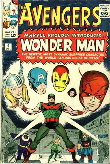 Again, the first cover makes the cut. 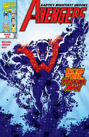 This one was a tough call. I was never a fan of the ionic look but the cover was very dynamic. 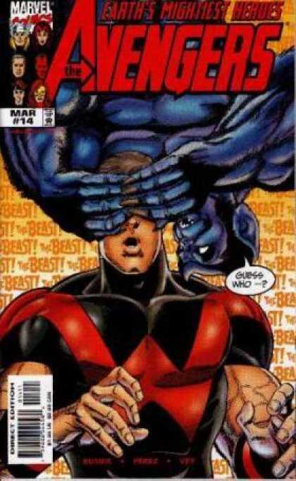 This may be a strange choice since Wondy's face is half covered but I love the fun of this cover. It instantly brings back memories of the Wonderman/Beast friendship that worked so well. |
|
|
|
Post by humanbelly on Feb 26, 2013 20:11:21 GMT -5
It's a bit of a curiosity, isn't it? The signature looks like. . . JK & Scott Bula (?) 2010, I think? At the risk of sounding like an old fogey, it seems AWFULLY presumptuous that any artist would say to himself, "Oh, this iconic Kirby cover's okay-- but I know some tweaks that'll make it REALLY good-!" It's not really an homage, as it uses too much of Jack's work-- it's really little more than a swipe, I daresay. The signature next to the JK looks like Steve Rude's and a quick search confirms this. I'd say nothing nefarious or covert is going on here, HB; Rude is praising the King, not burying him.  Perhaps Rude's cover was created for the Jack Kirby Collector or for some other Kirby-centric or Avengers tribute...or perhaps a fan commissioned this of Rude...or maybe Rude just wanted to take a shot at recreating a truly iconic cover. The JKC often features recreations by Mike Royer, Joe Sinnott and others, either from scratch...or they ink over copies of the original art photostats. Again, intended as tributes to Kirby. Aaaaaaah, you're right Shar, I'm probably being too much of a stiff-neck about it. Heck, singers are certainly free to sing other singers' signature songs if they've a mind to. As a tribute to Jack, it certainly reflects affection. I think I have a small poster in my basement of Alex Ross' take on the same cover-- which is pretty cool. Ah- yep, here it is:  Although I do worry that Giant-Man is about to take a hammer to the shin or knee if he's not careful. ;D HB |
|
|
|
Post by spiderwasp on Feb 26, 2013 22:32:24 GMT -5
 And then there's this version. 
|
|
|
|
Post by ultron69 on Feb 27, 2013 13:21:38 GMT -5
I probably won't continue to keep the Avengers in chronological order as it gets more complicated but it's easy in the beginning. That said, lots of people seem to consider Wonderman a member who joined in the 70s. I know that he joined for all the wrong reasons in #9 but he did join nevertheless. I'm also a believer in "Once an Avenger, always an Avenger" so this is where he fits in for me. Now, Simon was actually one of the harder ones to make this selections for. Even though he's had some good cover placements, so many of his costumes have been so bad that it was hard to qualify the covers as great. That green and red Christmas salute in the WCA was especially bad. Go ahead and through your stones but I actually liked the old red safari jacket, I just didn't see any covers where I thought it was featured well. Now, without further adieu, Here's Wondy... Actually, I like this costume tolerably well, and the one on the far right below is my favorite Wondy costume. I never did care for the red safari jacket. 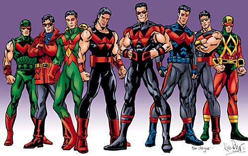 |
|
|
|
Post by wundagoreborn on Feb 27, 2013 14:55:50 GMT -5
Wondy is always flying behind Iron Man on West Coast covers, but on this one that lands him in the center of the pic: 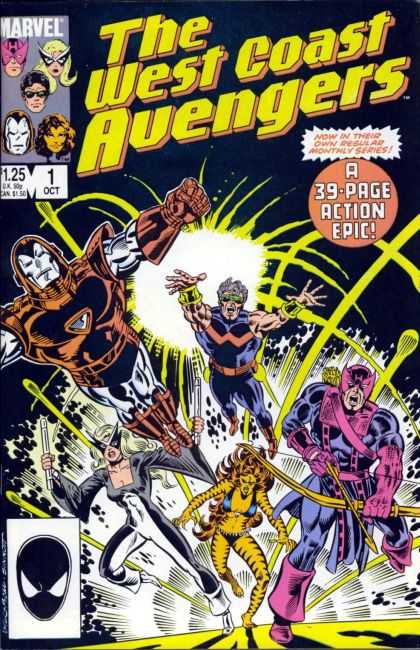 Another nice, dramatic, centerstage turn for him:  This costume, in the sans glasses version, is my favorite for him. |
|
|
|
Post by spiderwasp on Feb 27, 2013 20:34:46 GMT -5
One of many people's favorites (Including mine) - HAWKEYE! He actually had some pretty cool covers to choose from. 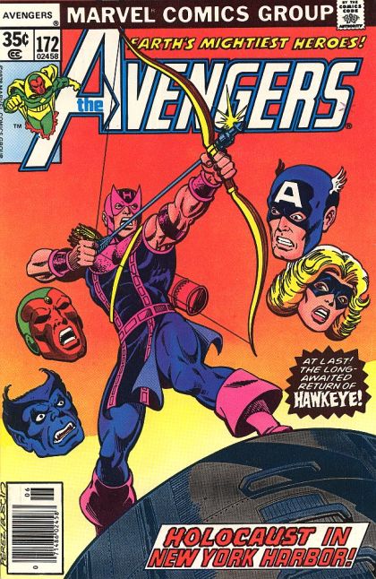 This is a nice cover. The floating heads were a cool, often used devise that allowed a single character to be nicely showcased but still displayed the concept of a team book.  My personal favorite. Expect to see this one again if I stick with this long enough to get to Scott Lang.  Hawkeye really came into his own in WCA and this cover made that clear from the beginning. |
|
|
|
Post by spiderwasp on Feb 27, 2013 20:47:56 GMT -5
Actually, I like this costume tolerably well, and the one on the far right below is my favorite Wondy costume. I never did care for the red safari jacket. #3 from the left is the one I was talking about that I think was awful. Apparently I wasn't alone. In its last appearance, his agent told him the public really hated it. |
|
|
|
Post by wundagoreborn on Feb 28, 2013 7:09:46 GMT -5
That one with Ant-Man is THE essential Hawkeye cover. Love it!
|
|
|
|
Post by humanbelly on Feb 28, 2013 7:32:26 GMT -5
That one with Ant-Man is THE essential Hawkeye cover. Love it! Totally agree. It is, in fact, one of my favorite Avengers covers, period. Quite awhile back we had a discussion about the "100 Greatest Marvel Covers" (something like that), and while this one wasn't on the linked list, it kept popping up in our own conversation. Jan-on-Cap's-chest is another one of my all-time favorites. Ha! And notice the extremely liberal use of those floating heads on WCA #1? What's particularly good is that they clearly convey a sense of "good ol' lovable rogue Hawkeye" affection from his peers. HB |
|
|
|
Post by sharkar on Feb 28, 2013 20:39:38 GMT -5
Ha! And notice the extremely liberal use of those floating heads on WCA #1? What's particularly good is that they clearly convey a sense of "good ol' lovable rogue Hawkeye" affection from his peers. LOL, that's actually a good segue to my choice of a favorite Hawkeye cover (OK, so this is not exactly what one would think of as a " Hawkeye" cover...but since Spiderwasp already posted the best Hawkeye covers, the pickings are slim! ;D). Anyway, here it is: Avengers #38. I have always loved this cover because of Clint's expression and the "emotion displayed" (one of Spiderwasp's categories). Hank's expression cracks me up too.  |
|
|
|
Post by sharkar on Feb 28, 2013 20:43:18 GMT -5
For Simon I like this cover--he's someone you wouldn't mind being stuck in a foxhole with.  |
|
|
|
Post by spiderwasp on Feb 28, 2013 23:26:43 GMT -5
One of my favorite characters here - Quicksilver  Pietro hasn't had a lot of great covers but this one is pretty nice. 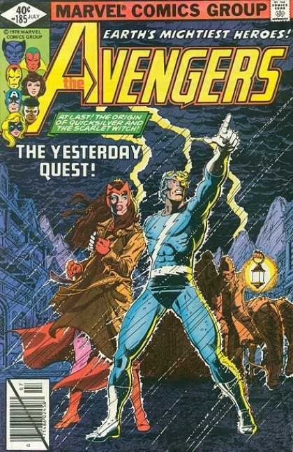 This is a really sharp cover and it's nice to see Pietro in a powerful position, but not running. He doesn't always have to be running.  Cage and company took Quicksilver out of a pretty dark place that I was afraid he would be trapped in forever and brought him new life. Therefore, this cover, for me, has sentimental appeal as well as artistic. |
|
|
|
Post by humanbelly on Mar 1, 2013 20:25:10 GMT -5
One of my favorite characters here - Quicksilver Pietro hasn't had a lot of great covers but this one is pretty nice. This is a really sharp cover and it's nice to see Pietro in a powerful position, but not running. He doesn't always have to be running. Cage and company took Quicksilver out of a pretty dark place that I was afraid he would be trapped in forever and brought him new life. Therefore, this cover, for me, has sentimental appeal as well as artistic. Oooh, that last one, though, makes me crazy because, even in the world of comic book contortion and exaggeration, that left arm is in a ridiculously absurd position. It really does kind of kill the effect of the cover for me (and a pretty decent one otherwise, too). It doesn't register as speed, it registers as a wickedly bad shoulder dislocation. The Wundagore Mountain cover is another particular favorite, though-- it has an incredibly cinematic feel to it. . . would really work as a movie poster. HB |
|
|
|
Post by spiderwasp on Mar 2, 2013 0:57:46 GMT -5
I'm sure it's no surprise that the next person on my list is...The Scarlet Witch 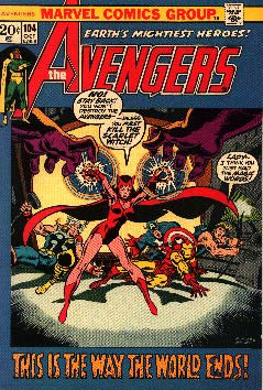 A nice strong image as Wanda comes into her own 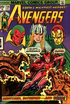 I've always been fond of this cover. You really get a feel for the danger she's in. I also love the look of concern on Ironman's ...uhm, mask.  This isn't the cover I own for this book but I kind of wish it as. It's beautiful image. |
|
|
|
Post by humanbelly on Mar 2, 2013 7:05:51 GMT -5
Say, SW, did you happen to notice that Wanda appears to be the only member that's been dominantly portrayed on three consecutive covers? (At least I think so-- I must admit my search was NOT incredibly in-depth. . . ;D) 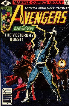 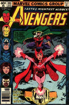 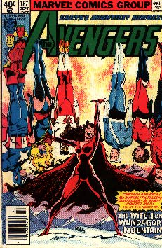 Quite a transformation, too. Frightened, passive sister to endangered hostage/victim to nemesis. Yikes! HB (mod. to add NOT above-- good grief, changes the whole comment!) |
|
|
|
Post by spiderwasp on Mar 2, 2013 10:34:37 GMT -5
Say, SW, did you happen to notice that Wanda appears to be the only member that's been dominantly portrayed on three consecutive covers? (At least I think so-- I must admit my search was NOT incredibly in-depth. . . ;D) Nice observation. You're right - that NOT does make a difference. |
|
|
|
Post by wundagoreborn on Mar 2, 2013 12:08:53 GMT -5
Here's a shocker -- I'm a big fan of that series of Wanda covers too. |
|
|
|
Post by spiderwasp on Mar 2, 2013 14:15:30 GMT -5
Here's a shocker -- I'm a big fan of that series of Wanda covers too.  Color me shocked |
|
|
|
Post by humanbelly on Mar 2, 2013 14:22:19 GMT -5
Here's a shocker -- I'm a big fan of that series of Wanda covers too. Ha! By the High Evolutionary's Scarlet Faceplate, that is indeed YOUR arc, baby! (Hmm-- probably several other appropriate oaths one could coin along those lines. "By the Sweet Milk of Beneficent Bova!" "By the Great DNA Accelerator!" "By Mealy Mordred's Milky-white Mane"-- etc) HB |
|
|
|
Post by humanbelly on Mar 2, 2013 23:51:01 GMT -5
Wait, wait-- SW, you've clearly missed several CLASSIC Wanda covers!!! What gives-? 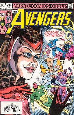 (I'm being a little snarky. I actually do kind of like this Milgrom cover) And then of course there are these timeless masterpieces:   What's scary is that I don't remember hating Force Works at the time as much as I do now. But, boy, I look at those covers and. . . whew! The less said, the better! Heh- HB |
|
|
|
Post by tomspasic on Mar 3, 2013 4:57:11 GMT -5
HB Speaking of dislocations.... How can an "artist" imagine a human being can twist like that. I know there is a convention to try to show t&a on female characters as much as possible, but this is just horrible. And it's not just the spine-mangling. The absurdly tiny waist. The thighs are different lengths, and both curve forwards slightly. The left calf curves forward a lot. It's certainly a memorable image, but for the wrong reasons.... |
|
|
|
Post by spiderwasp on Mar 3, 2013 10:04:49 GMT -5
It's certainly a memorable image, but for the wrong reasons.... The really scary part - it's better than some of the art that was inside Force Works |
|
|
|
Post by spiderwasp on Mar 3, 2013 10:11:41 GMT -5
Here's another of those characters that I thought had more memorable covers than I actually found: Hercules 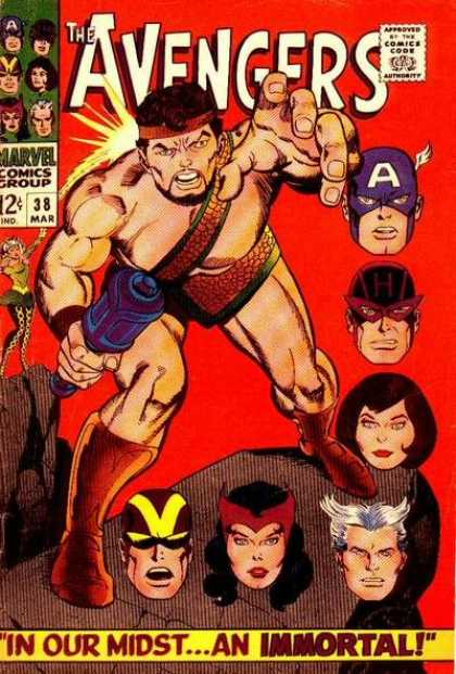 As with others, the first appearance and the floating heads.  I always liked this cover. It's not the greatest Hercules pose in the world but it's okay. As an overall image, it's good though. 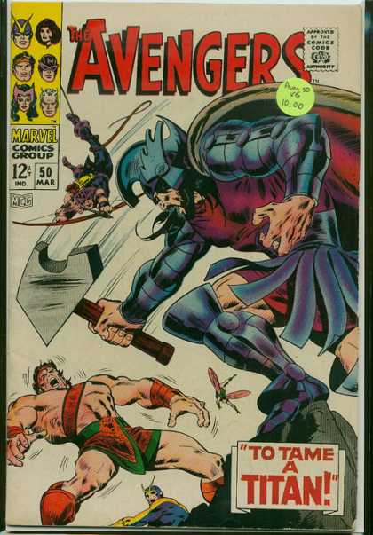 I don't even think this is a particularly great cover, especially for a 50th issue. It certainly doesn't make Herc look good but it does feature him. I hope someone can dig up something I missed and one up me on this one. |
|
|
|
Post by wundagoreborn on Mar 3, 2013 14:42:39 GMT -5
Hey, kids, let's play Tug-O-Herc! 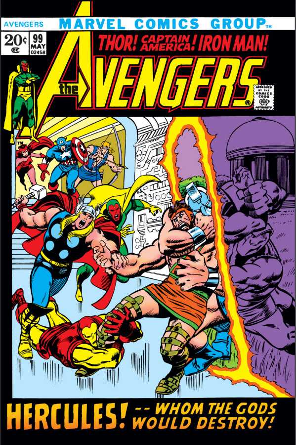 At least he gets big lettering here. But you're right, given the weak representation of the Lion of Olympus, I should probably withdraw my charge of size-ism. |
|
|
|
Post by humanbelly on Mar 3, 2013 15:30:25 GMT -5
Here's another of those characters that I thought had more memorable covers than I actually found: Hercules As with others, the first appearance and the floating heads. I always liked this cover. It's not the greatest Hercules pose in the world but it's okay. As an overall image, it's good though. I don't even think this is a particularly great cover, especially for a 50th issue. It certainly doesn't make Herc look good but it does feature him. I hope someone can dig up something I missed and one up me on this one. If you keep pressing on to later issues, after Herc's recovered from his Mansion Siege injuries (particularly into and beyond the Gatherers era), SW, you do come across several more Herc-focused covers. The one below, while maybe not a masterpiece, does represent an unusually poignant personal story arc for the Olympian. 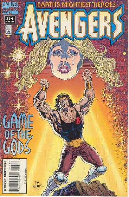 It contained one of the most chillingly cold-blooded acts by Zeus that I think could be imagined-- perhaps moreso than even the writer realized. Changed my opinion of the moral foundation of these "god" races in the MU forever. HB |
|
|
|
Post by spiderwasp on Mar 3, 2013 17:01:30 GMT -5
It contained one of the most chillingly cold-blooded acts by Zeus that I think could be imagined-- perhaps moreso than even the writer realized. Changed my opinion of the moral foundation of these "god" races in the MU forever. HB I had forgotten that story but I remember what you're talking about it was pretty harsh. This cover is not bad. The lettering is weird though. It kind of looks like "Lame of the gods" or would that be "Lods?" |
|
|
|
Post by spiderwasp on Mar 3, 2013 21:38:47 GMT -5
Now we move to a character who had some great covers - the Black Knight 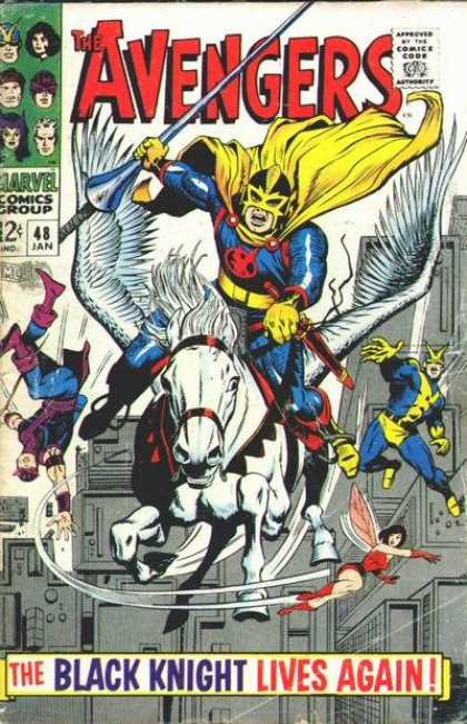 Another first appearance but no floating heads this time, just floating people. 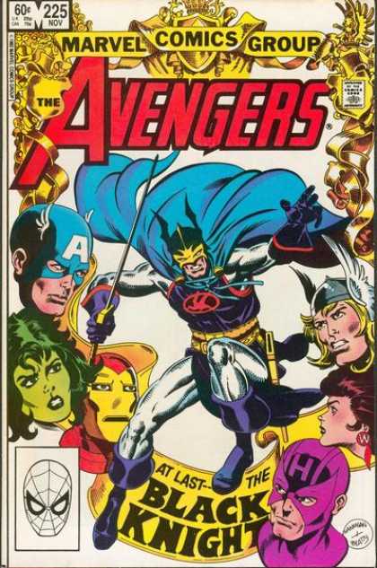 Now we have floating heads. This cover has a really great regal look to it.  I remember being surprised that the Knight was chosen for such an honorary postion on the anniversary cover but good for him. |
|
|
|
Post by humanbelly on Mar 4, 2013 21:48:23 GMT -5
Now we move to a character who had some great covers - the Black Knight Another first appearance but no floating heads this time, just floating people. Now we have floating heads. This cover has a really great regal look to it. I remember being surprised that the Knight was chosen for such an honorary postion on the anniversary cover but good for him. I loved the fact that Dane was the Face of the Avengers for the 25th Anniversary cover convention. There are several characters whose existence has been pretty steadfastly rooted in being an Avenger, and Black Knight is one of the primary ones, along with the Vision. It's easy to forget that he's another one of our long-standing no-real-powers heroes. . . like Hawkeye, Cap, and Black Widow. There were at least a couple of good, later covers for him as well: 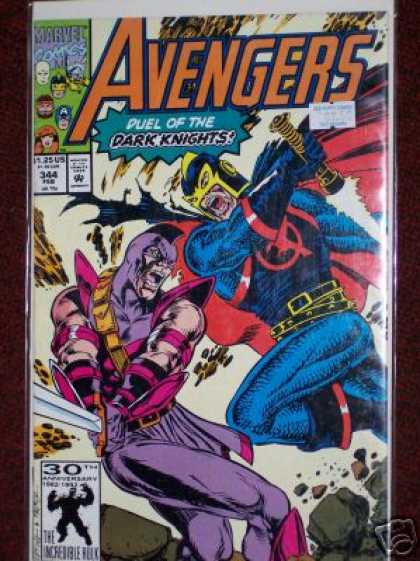 Ha! I'll include this one simply 'cause it'll make the host of bomber-jacket nay-sayers do an unfashionable spit-take-!: 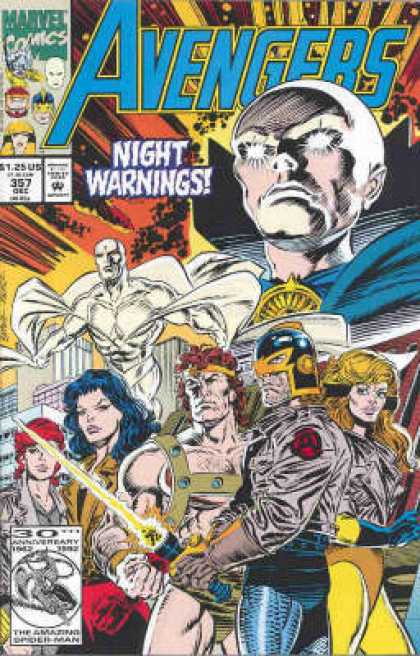 And I feel like I WOULD like this one a LOT if I could just flippin' SEE it-!:  He really has a pretty darned good-looking costume that hasn't needed much updating over the years at all. HB |
|
|
|
Post by spiderwasp on Mar 4, 2013 22:21:05 GMT -5
Before I move on the way you expect, I'm going to back up and include an early Avenger who often gets forgotten - Rick Jones - the boy who called them all together in the first place.  Rick rarely made the cover, but for this one he was not only pictured but also listed as Cap's partner.  This was, of course, THE Rick Jones cover and moment.  Then again, this cover was pretty great too and the series was even better. |
|
|
|
Post by wundagoreborn on Mar 5, 2013 9:54:06 GMT -5
"Rick Jones Conquers the Universe" sounds like it could be a sit-com or movie title, ala "Clarissa Explains It All" or "Jay and Silent Bob Strike Back"
|
|


 Color me shocked