|
|
Post by scottharris on Jun 29, 2009 0:48:29 GMT -5
#11Brilliant cover, especially for the first appearance of a new character. If I had been a kid and saw this on the newsstand I probably would have passed out. 
|
|
|
|
Post by scottharris on Jun 29, 2009 0:50:00 GMT -5
#10Another legendary effort from John Buscema. I think it goes without saying that this is one of my personal favorites: 
|
|
|
|
Post by scottharris on Jun 29, 2009 0:51:10 GMT -5
#9Neal Adams, blowing your mind: 
|
|
|
|
Post by scottharris on Jun 29, 2009 0:53:16 GMT -5
#8It's taken me a long time to warm to this cover, but I guess I really do have to give it its due. 
|
|
|
|
Post by scottharris on Jun 29, 2009 0:55:40 GMT -5
#7You just can't beat this (even though it's at #7 instead of #1, trust me, you can't beat it. So don't even try.): 
|
|
|
|
Post by scottharris on Jun 29, 2009 0:57:38 GMT -5
#6Not only is it vastly important to comics history; and an interesting relic of world history thanks to the confrontation with Hitler on the cover prior to America entering the war; it's also one of the best pieces of art Simon and Kirby ever put out. The Cap on this cover just looks terrific: 
|
|
|
|
Post by scottharris on Jun 29, 2009 0:58:53 GMT -5
#5Dave Cockrum and Gil Kane bring an instant classic that has been the subject of uncountable homages: 
|
|
|
|
Post by scottharris on Jun 29, 2009 0:59:45 GMT -5
#4Steranko's best known (and best) cover: 
|
|
|
|
Post by scottharris on Jun 29, 2009 1:00:30 GMT -5
#3Genius. 
|
|
|
|
Post by scottharris on Jun 29, 2009 1:03:30 GMT -5
#2Justly famous as one of the greatest covers in comics history. Marvel should issue a public apology for not putting this on their official list, fan voting or no fan voting: 
|
|
|
|
Post by scottharris on Jun 29, 2009 1:04:50 GMT -5
#1I don't think this is really debatable, which isn't to say I wouldn't welcome debate, but I just have a hard time imagining anyone refuting this selection: 
|
|
|
|
Post by freedomfighter on Jun 29, 2009 11:22:42 GMT -5
good list. one correction on your #5- it's a Gil Kane/Dave Cockrum collaboration. I am such a kane fan that I recognize his distinctive energy and signature touches like the deep cheekbones on women and the super sinewy arm muscles on everybody...
|
|
|
|
Post by scottharris on Jun 29, 2009 13:00:15 GMT -5
Yea, it was just really late when I put the list together. Correction made. Kane is one of my favorites as well, especially for cover work, especially during the great frame era when he was doing most of Marvel's covers. His designs almost always had a central figure that really commanded your attention while not being a simple pinup or static image, plus they told a story related to the interior. One of the best cover artists ever.
|
|
|
|
Post by bobc on Jun 29, 2009 13:14:37 GMT -5
Very good list. That Tomb of Dracula cover is the one I'm sure most TOD fans remember best from that time period.
|
|
|
|
Post by humanbelly on Jun 29, 2009 13:48:37 GMT -5
Yea, it was just really late when I put the list together. Correction made. Kane is one of my favorites as well, especially for cover work, especially during the great frame era when he was doing most of Marvel's covers. His designs almost always had a central figure that really commanded your attention while not being a simple pinup or static image, plus they told a story related to the interior. One of the best cover artists ever. I have some very fond memories of the frame-cover period, as well. And, y'know, if you look at the letters pages from that period, the fans really seemed to HATE them! I can't recall a single "love the frames!" missive at all. My thinking would be, does it have to be an all-or-nothing convention? Seems like a little bit of a heavy-hand from the editorial end. (Boy, it also reminds one of the years-long arguing about the use of word-baloons on covers!) HB |
|
|
|
Post by freedomfighter on Jun 29, 2009 15:59:24 GMT -5
Yea, it was just really late when I put the list together. Correction made. Kane is one of my favorites as well, especially for cover work, especially during the great frame era when he was doing most of Marvel's covers. His designs almost always had a central figure that really commanded your attention while not being a simple pinup or static image, plus they told a story related to the interior. One of the best cover artists ever. Oh I figured you knew. I've read many of your long form posts my friend. I know you know comics... I just love Kane so much that he had to get his props. He may be my favorite silver age artist, period. |
|
|
|
Post by scottharris on Jun 29, 2009 16:14:40 GMT -5
I've gotten some feedback on the list and the one comic that has been suggested that I may have to add to the list is Avengers #16. I always think of this in terms of the story and not the cover, but now that it has been pointed out I have to agree that it probably should be on the list. Oddly, I think being such a big Avengers fan sort of blinded me to the importance of this cover; for non-Avengers fans I think the image of Cap shouting "Avengers Assemble!" on the cover is probably more iconic than it is for someone who has seen this inside the book 500 times. I'm currently debating where to slot this in and what will be dropped to make room for it. Suggestions?
[edit: I put it in at #35 and dropped Avengers Special #2 down to #41. I also added a classic golden age Cap cover that I had forgotten about, replacing the All Select Schomburg cover at #67]
Another suggestion was FF #12, the first Hulk vs. Thing. Personally, I think this is a classic because of the fight and not the cover and I don't think it warrants inclusion, although I recognize a case can be made for it. Any opinions?
|
|
|
|
Post by scottharris on Sept 12, 2009 15:14:35 GMT -5
I just wanted to post here that I've been wondering for a long time who did that Tomb of Dracula cover, as it isn't signed that I can see. It's so beautiful, but it doesn't look like Colan. And in fact, it turns out the cover artist was...
...Neal Adams! Man, I never would have pegged that. I can see it maybe just a little in Dracula's face, but this totally doesn't look like his usual style. That guy could draw, for real.
|
|
|
|
Post by Shiryu on Sept 12, 2009 16:30:27 GMT -5
#1I don't think this is really debatable, which isn't to say I wouldn't welcome debate, but I just have a hard time imagining anyone refuting this selection: I was recently surprised to read that this cover is by Kirby, and Ditko only inked it. I suppose it's quite obvious by the face of the guy under Speady's arm, but it never dawned on me to pay attention to it. Apparently Stan thought that the original cover by Ditko lacked dynamism. |
|
|
|
Post by scottharris on Sept 12, 2009 18:49:46 GMT -5
As usual, I think Stan's editorial decisions were spot on. The original Ditko cover is more in keeping with the spirit of the character, but it's not as arresting an image. I think that (in the past, anyway) having a great cover for a character's first appearance is key for the character's success, and Stan (and Jack) got it right. Here's Ditko's original cover for Amazing Fantasy #15 (which is certainly cool in its own right, but just not as iconic or damatic in design):  |
|
|
|
Post by ultron69 on Sept 14, 2009 14:44:32 GMT -5
Good list. It was fun looking through those classic cover. As to FF#1, I believe Marvel's comics were actually being distributed by DC at the time, and they basically didn't want DC to know they were making a superhero comic, so they intentionally didn't put the FF in teir costumes, and tried to make it look like a monster comic. I'm sure that changed Kirby's approach somewhat. I do have to point out one glaring omission in your list. My all time favorite cover-Secret Wars #4. And I'm not even a Hulk fan, but this is so darn cool!  |
|
|
|
Post by scottharris on Sept 14, 2009 15:04:25 GMT -5
I definitely considered Secret Wars #4 for the list. When I was putting it together, I found that there were only about 40-50 covers that were real shoo-ins, and then a couple hundred others that were great covers but not necessarily must haves. So for me, some of those others beat out this cover for the final spots, but it was certainly in the running.
After I finished this list, I noticed something -- I neglected to put Journey Into Mystery #83 on the list. What's funny is that nobody here or at the other places I posted this list ever said anything about it. What do you guys think? Should JiM #83 be on the list? Or does the fact that everyone forgot about it indicate it's not really a top cover after all?
|
|
|
|
Post by dlw66 on Sept 14, 2009 17:03:52 GMT -5
I think if it were on the list, it would be for its status as an issue, not as a cover. JIM #89, which you did cite, is a better image of Thor. But for my money, the best Silver Age cover of Thor is #168 (with #156 and #169 being close on its heels: 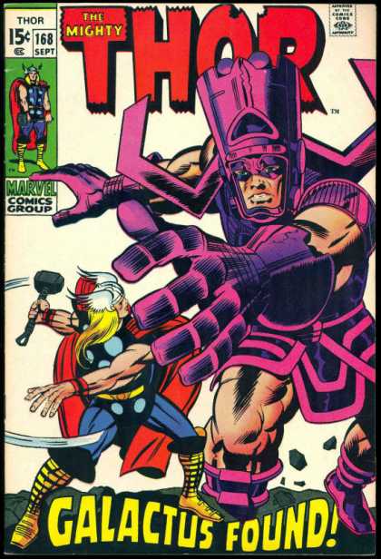 |
|
|
|
Post by sharkar on Sept 14, 2009 19:22:34 GMT -5
After I finished this list, I noticed something -- I neglected to put Journey Into Mystery #83 on the list. What's funny is that nobody here or at the other places I posted this list ever said anything about it. What do you guys think? Should JiM #83 be on the list? Or does the fact that everyone forgot about it indicate it's not really a top cover after all? We did explore the top 5 Thor covers some time ago and there were a lot of striking Thor/JiM covers posted; from what I can tell (lots of links to the covers we posted are disabled), no one cited #83. (And yes, when I have some time I plan to substitute fresh links for some of my covers over there!) vplexico.proboards.com/index.cgi?board=general&action=display&thread=1817I think if it were on the list, it would be for its status as an issue, not as a cover. JIM #89, which you did cite, is a better image of Thor. I agree 100% about JiM #89's cover; that it's a classic Thor image is indisputable. JiM #83's cover taken on its own is not particular memorable; IMO its chief value lies in hindsight (its historical significance). It also suffers in comparison to an image that was produced less than six months later, the aforementioned image on #89's cover. This is the quintessential Thor we think of from the Silver Age: a truly godlike figure with a perfect stance and physique (T-shaped torso, etc.)...not the awkward figure on #83. (That #89's image was used for marketing--deservedly so, IMO--is another reason why we remember this particular image.) In fact, #83's cover--with its inclusion of green-skinned alien-looking creatures--is almost indistinguishable from the preceding monster-themed Journey Into Mystery covers (whether by design, as ultron69 mentioned--or just out of habit); as we are probably all aware, during the transition from Atlas to Marvel, the earliest Marvel superhero covers--FF, Ant-Man, Hulk--all had the Atlas monster/sci fi element.   |
|
|
|
Post by ultron69 on Sept 15, 2009 6:42:41 GMT -5
This is an almost impossible task, harder than picking the top 70 comics of all time, IMO.
By the way, #61 and #41 do not show up here for me. I get the dreaded red X. What issues are they?
|
|
|
|
Post by scottharris on Sept 15, 2009 16:18:28 GMT -5
#61 is Secret Wars #8, which I've had several people tell me is a really crappy cover, so I might swap that out; and #41 is Avengers Annual #2.
|
|
|
|
Post by scottharris on Sept 15, 2009 18:49:18 GMT -5
By the way, I've had several comments over on my facebook page totally bagging on Journey Into Mystery #89. This is a surprise to me because I think it's a beautiful cover, and it's one of my favorites. Thoughts?
|
|
|
|
Post by spiderwasp on Sept 15, 2009 20:13:30 GMT -5
By the way, I've had several comments over on my facebook page totally bagging on Journey Into Mystery #89. This is a surprise to me because I think it's a beautiful cover, and it's one of my favorites. Thoughts? Sorry Scott, but I have to join the several comments. That one just doesn't do much for me. |
|
|
|
Post by freedomfighter on Sept 16, 2009 1:22:46 GMT -5
the Thor image on JiM #89 is a majestic one, but the cover itself is kinda blah. I believe graphitti re-issued the t-shirt a few years back and Thor is just standing on a crisp white background and the figure pops a whole lot more. The execution simply isn't great in terms of a full cover... imagehost.vendio.com/preview/wk/wkingst1/Thorfull.jpg |
|
|
|
Post by ultron69 on Sept 17, 2009 7:06:51 GMT -5
Yeah, that shirt does seem to be lacking something.
|
|